A Photo Rich Travel App Helps Travelers Discover New Places & Plan Upcoming Vacations
goop has defined a new modern lifestyle brand through its distinctive voice and compelling point of view. Knowing there was an opportunity to expand on the well-loved travel app, their team partnered with us to uncover how goop can better engage their readers. We conducted a research study with goop customers to learn how the brand fits uniquely into their lives, as well as the ins and outs of their travel styles and behaviors. These insights set the foundation for a personalized travel app experience.
What We Did
- Customer survey
- Diary study
- Product discovery workshop
- UX design
- Visual design
Project Type
- Travel & Leisure
Project Date
- 2018-2019
What We Learned
Discovering the app opportunity
Since 2008, goop has accumulated a vast catalog of valuable lifestyle resources for its readers. Readers return to goop to be inspired by style, travel, wellness, recipes, and more. To learn what type of app would be most valuable to goop readers, we researched how users incorporate goop into their daily lives.
We first surveyed readers about how they engage with goop – which types of content resonated with them, how and when they consumed content and goop’s broader influence in their lives. From the responses, we selected individuals to talk with us more in-depth about their lifestyles and personal goals, as related to different goop offerings.
During the interviews, we heard first-hand the trust that readers put in goop to curate the best experiences across travel with style, food, and wellness in a way that resonates with them. They shared their specific habits and priorities in how they travel, whether they are scheduled planners or more in-the-moment explorers.
Travel planning has different starting places and priorities, each driving different user behaviors

Travel planning has different starting places and priorities, each driving different user behaviors
Our Approach
Designing the ideal travel companion user experience
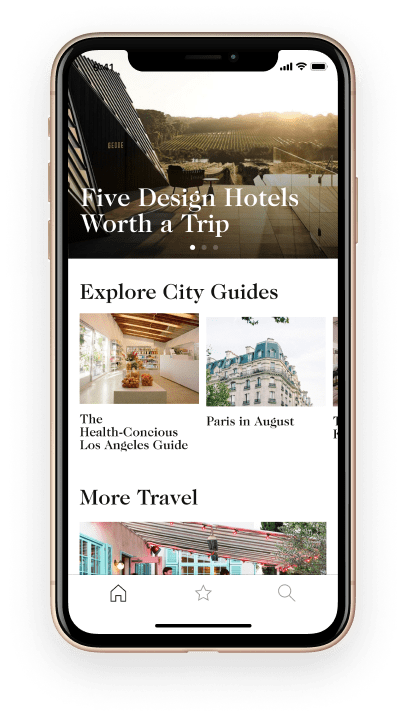
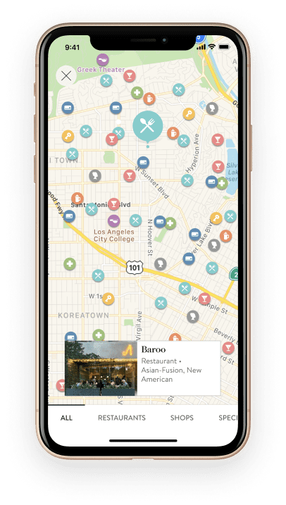
We designed an app that can grow from the MVP into an app with rich features. Starting with the MVP, we updated the UI and created a flexible design system that can grow into the full product vision. The MVP features improved navigation, integrated maps, and a CMS platform for releasing new content.
We implemented geo-location services that allow one-tap access to recommended places near you. Future iterations of the app will include a chat concierge service and travel planning tools. The result is a focused app experience that is true to the goop brand and sets the stage for continued feature releases.
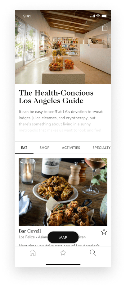
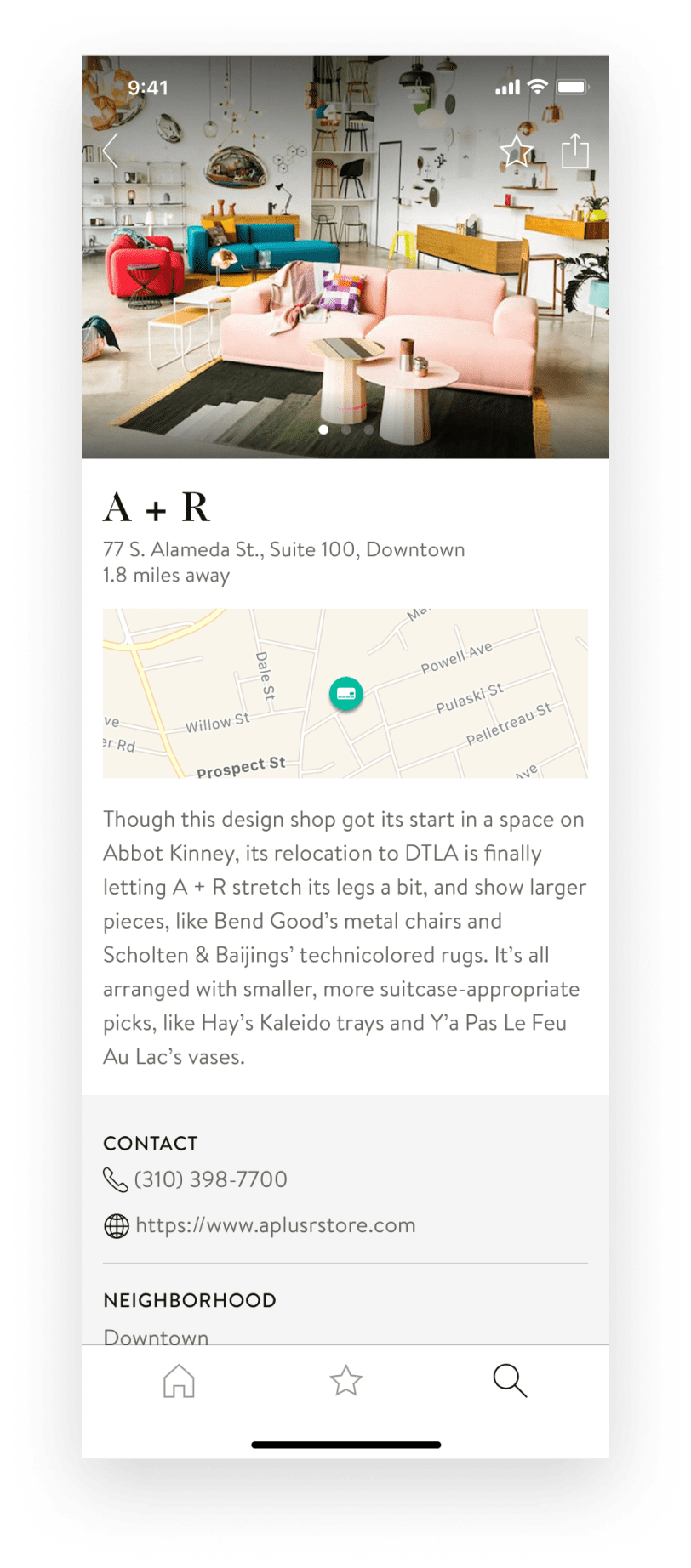
Design System
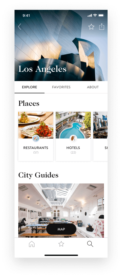
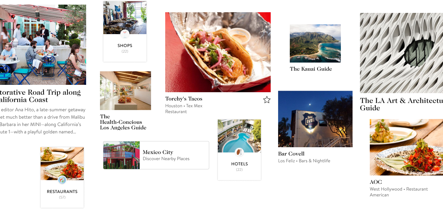
A flexible design system focused on photography
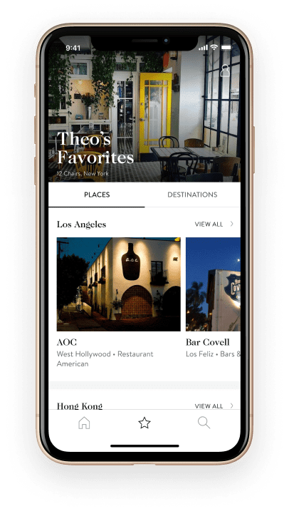
The app has three primary modes: reading inspiring travel articles, exploring curated city guides and creating personal lists of favorite places. With inspiration and discovery as the core experience principles we designed a flexible card based UI design system that highlights the photography and allows the user to easily navigate the app.
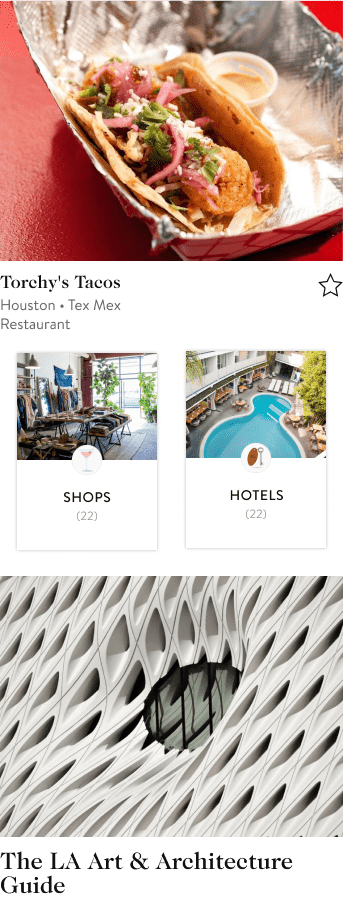
Outcomes
An evolving app for the curious traveler
We successfully overhauled the previous G.Spotting app with a new user experience that allows travelers to discover new places and plan for their next adventure. Along with a flexible card based UI the new user experience includes a ‘Near You’ feature using geo-location services, search within destinations, personalization via favoriting, place coordination with Google maps and an updated destination IA that highlights place and city guide content.
