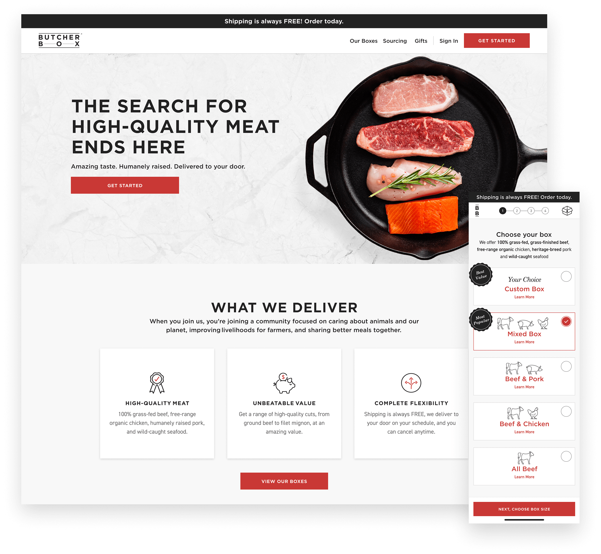
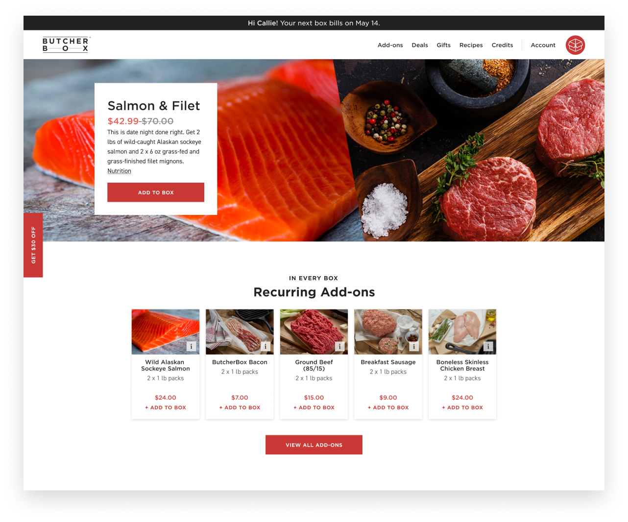
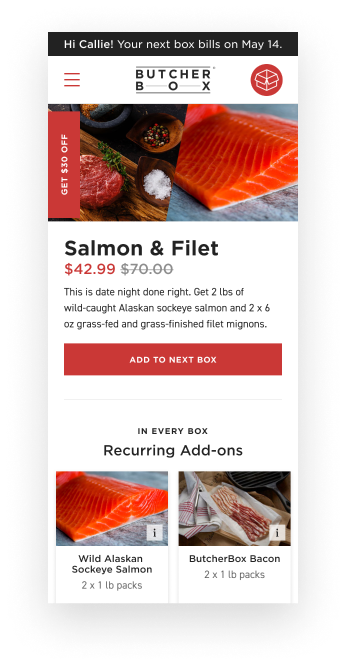
The homepage redesign highlights what matters most to customers—high-quality meat, value and flexibility—while the onboarding flow was reimagined for a mobile-first experience.
![]()
ButcherBox delivers premium, ethically sourced meat directly to members’ doors—a product people love. But their digital experience wasn’t keeping up. Prospective customers were dropping out of a convoluted mobile signup flow before ever placing an order. Meanwhile, existing members were struggling to manage their subscriptions through an interface that generated complaints and drove unnecessary calls to the customer service team. Everyday Industries partnered with ButcherBox’s product and technology team to fix both problems: a newly design mobile first signup flow, a fully redesigned member shopping experience, and a subscription management UI that actually works.
We started with an in-depth user experience assessment that consisted of a UX audit, unmoderated usability testing, and interviews with current members.
Three findings shaped everything that followed. First, the signup flow asked for too many decisions at once—users couldn’t tell how long it would take or what they were committing to, so they left. Second, the value proposition was buried: ButcherBox’s quality and flexibility weren’t communicated until too late in the funnel. Third, members managing their subscriptions faced a fragmented interface with no clear hierarchy, leading to confusion and preventable support calls.
Insights gained during the UX assessment aligned the team on design opportunities for the new acquisition flow and member experience: 1. Communicate ButcherBox service and product benefits early and often, 2. anticipate a member’s information needs, and 3. create a consistent mobile first design system.
The UX assessment highlighted challenges potential customers encountered within the mobile sign up flow, and top complaints among current customers.

The UX assessment highlighted challenges potential customers encountered within the mobile sign up flow, and top complaints among current customers.
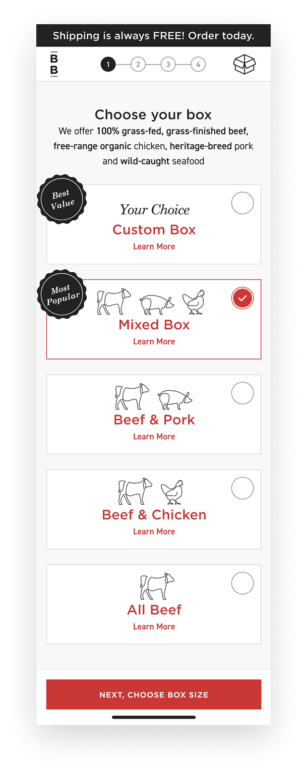
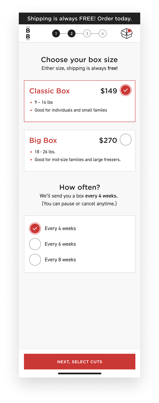
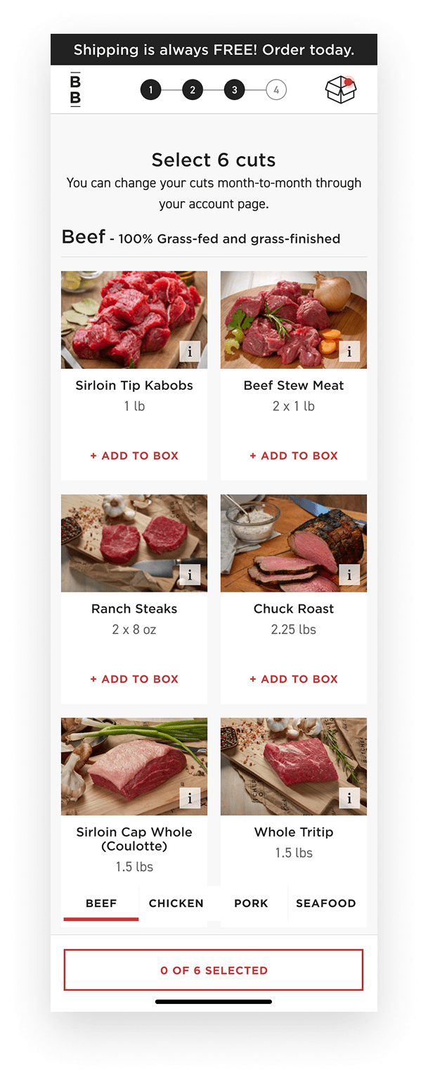
The old signup flow had no visible finish line. Users didn’t know how many steps remained or what they’d chosen so far—two things that reliably cause abandonment on mobile.
We redesigned it as a clear, four-step flow with generous tap targets built for thumbs. A progress indicator at the top of each screen set expectations upfront. A persistent ‘Your Box’ panel let users see and edit their selections at any moment, removing the anxiety of feeling locked in. At each step, we surfaced ButcherBox’s quality and value messaging—not as an afterthought, but as part of the flow itself.
We validated the redesign with usability testing before launch and iterated on two friction points identified in those sessions.
Next, we used the same principles from our UX assessment to create a simple mobile first shopping and subscription management experience.
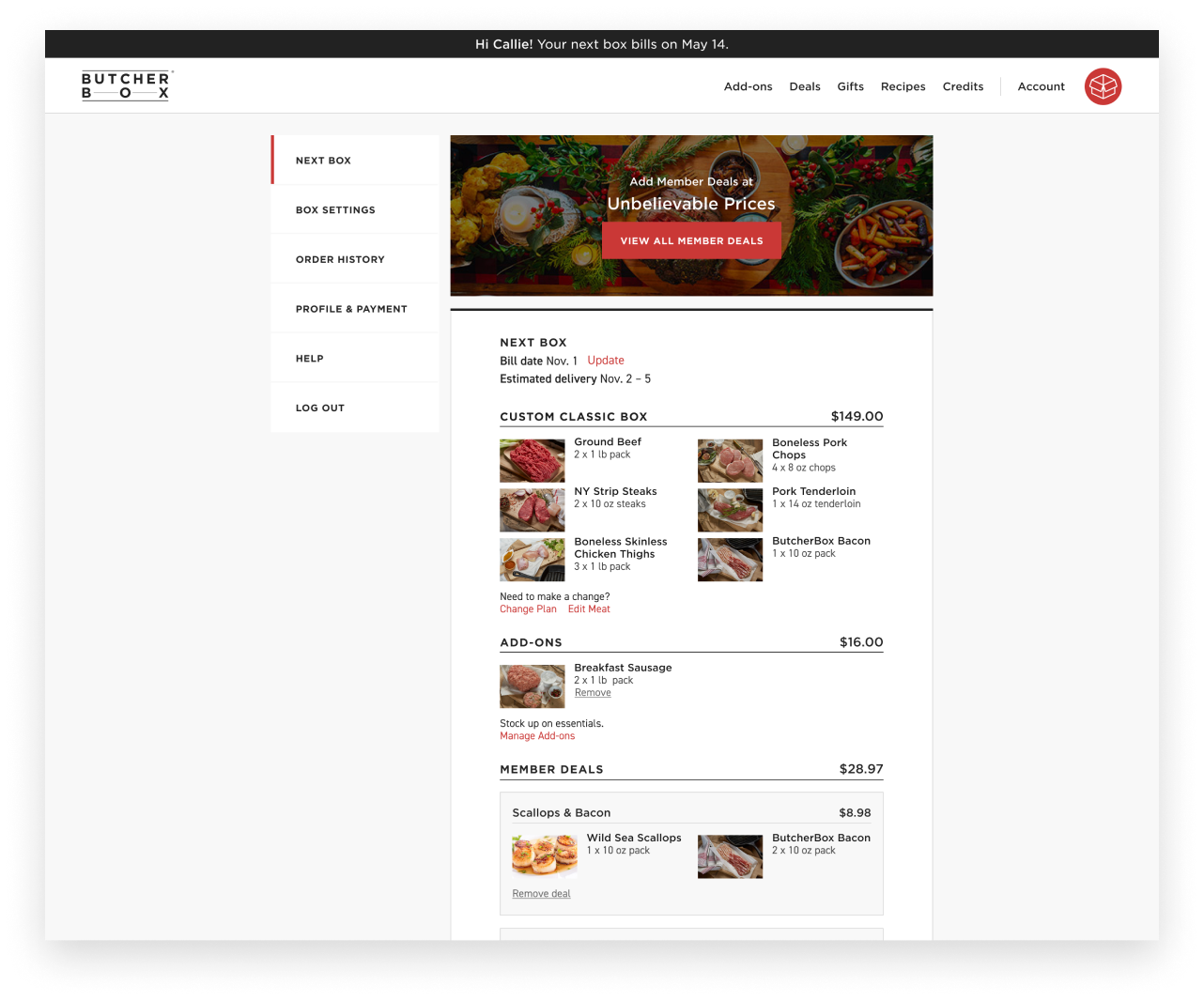
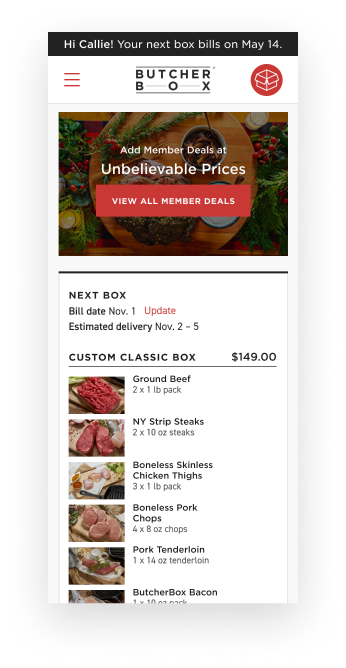
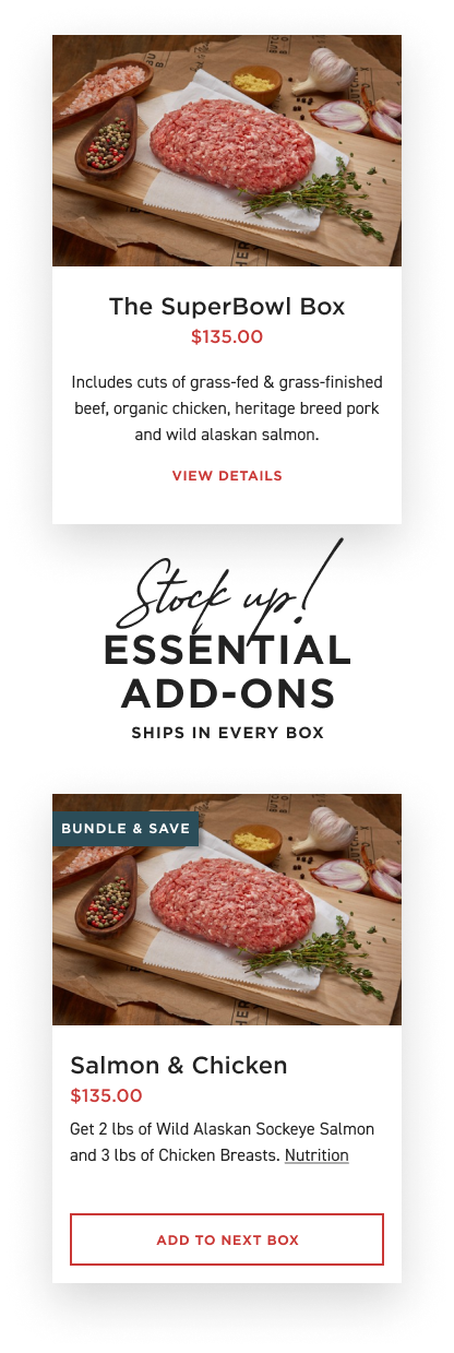
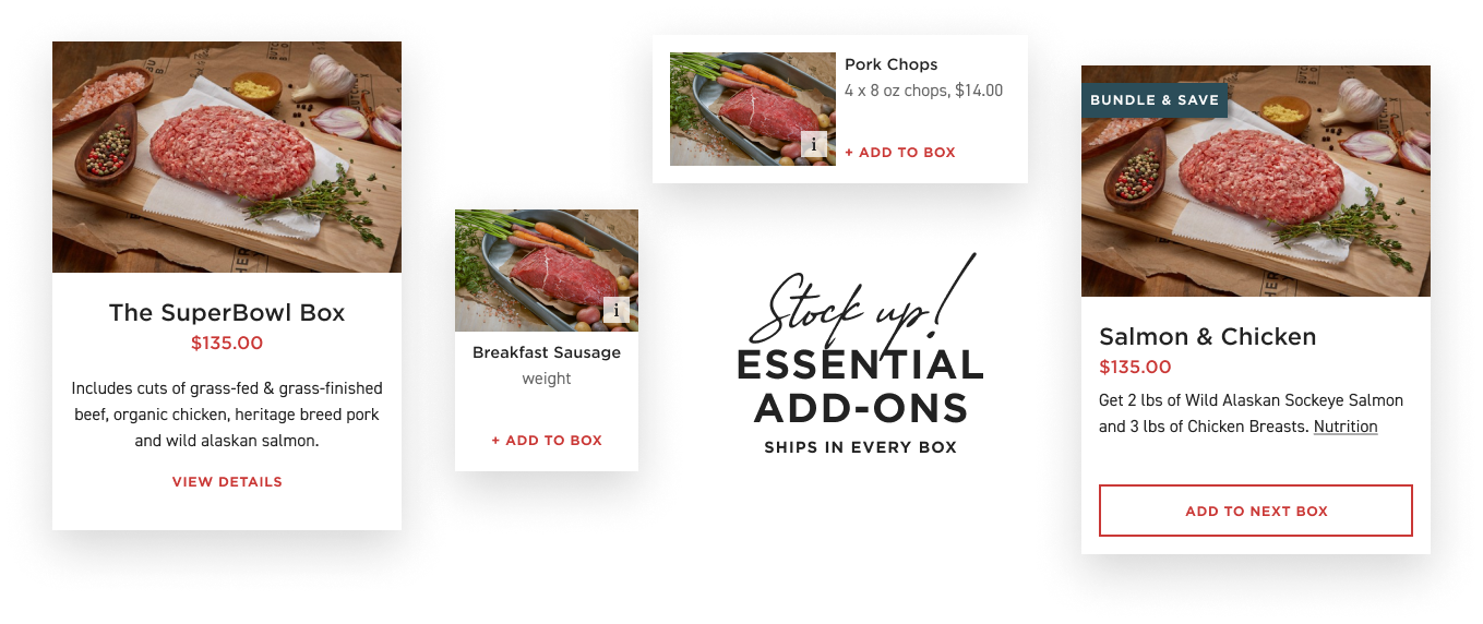
We designed a new member homepage and navigation that promotes deals and add-ons, and reinforces ButcherBox’s service benefits. We redesigned the subscription management experience to prioritize the most important information at-a-glance: cuts in your box, bill date, estimated delivery, and total cost.
A sub-navigation provides members a clear path to access box settings, view order history and update their profile & payment information. We also created a mobile first design system that can be extended to future feature releases creating a cohesive digital product experience.
The redesigned signup flow produced a meaningful lift in mobile conversion—the primary metric the team had set out to improve. Average order values rose as the new member experience made it easier to discover and add deals to upcoming boxes.
The subscription management redesign had an outsized operational impact: inbound calls to the customer service team dropped as members could now find answers and make changes on their own.
Callie DePinaEveryday has been an amazing partner – they work in such a collaborative way that they truly feel like an extension of our internal team. The UX thinking they have brought to our process has helped us prioritize the things we know are important to our members. As a result, our overall site experience has improved significantly since we brought them on board!”
We partner with you across discovery, design, and delivery acting as an extension of your product team to help shape direction and execute development ready designs.
If users are struggling, dropping off, or not engaging as expected, we help uncover what’s getting in the way and how to fix it. Our focus is on practical improvements that make experiences clearer, easier, and more effective.
Get expert insight into your product experience. Our comprehensive evaluation identifies opportunities to improve usability, engagement, and conversion through design.