How to Leverage a UX Assessment to Improve Key Conversion Metrics
Conversion By Thomas DiNatale ▪ January 11, 2023
Out with the old and in with the new. Now is the perfect time to reflect on your product’s user experience as you work towards this year’s goals, especially if your team has a product roadmap focused on high growth.
Your product goals are ambitious and most likely touch many aspects of the product’s user experience. For example, maybe you plan to improve customer satisfaction and drive better retention by finally tackling personalization.
You may want to grow your customer base and revenue by adding a new product or expanding into a new vertical. Or, if you run a subscription service and are particularly attuned to LTV and AOV growth, you may have a slate of new features that will increase the number of items added to the cart and drive repeat purchases.
The question is: which customer needs are you not addressing in your current user experience that could derail the goals you’ve set for your product? A UX assessment can provide the answer. With a UX assessment, you can identify UX friction, experience breaks, and user confusion. An assessment can also align your product and engineering teams; they’ll see eye-to-eye on existing customer needs before designing and building new experiences.
The UX Assessment: a 3-Lens Approach to Solving Conversion Gaps
A UX assessment goes further than a simple audit. While audits focus on areas where the UX is not meeting the mark, an assessment goes further because it includes UX design recommendations on which improvements will directly impact you business goals most.
Our UX assessments are composed of three steps, or what we’ve termed a “3 Lens Approach,” to comprehensively examine your product’s user experience. These steps include:
Pull it all together, and your team will gain clear direction on how to solve gaps in your product’s overall user experience. You’ll know exactly where your digital product isn’t solving customer needs and which UX design improvements will have a game-changing impact on this year’s new product initiatives.
What problems can a UX assessment help solve?
UX assessments can bring to light many issues in the user experience — not just conversion and retention problems. Here’s how you know you’re due for an evaluation.
- Understanding customer motivations and behaviors is a struggle.
- Key metrics are trending in the wrong direction.
- Customer engagement has been steadily declining over time.
- Your CX team is overwhelmed with inbound requests for help.
- Aligning your team toward common goals is challenging.
Ready to get started? Let’s dive deeper into the steps we recommend.
1. Usability Evaluation: Setting a UX Baseline
Starting the assessment with a usability evaluation is essential because it provides a holistic overview of the product experience from the customer’s perspective, guiding the customer interviews and session analysis. The evaluation phase focuses on usability principles, website messaging, and customer information needs.
The first step in the process is to document every screen and feature of the experience – from high-level flows to screenshots of pages and views across mobile and desktop. Then, with this in hand, examine your website and see if it aligns with UX best practices and recognized usability principles — design consistency and predictability. While poor usability is undoubtedly a source of UX friction, it’s also critical to evaluate the product with the following questions in mind:
- Is there a consistent use of language and visuals?
- Are the product benefits and value proposition clearly communicated?
- Is there a structured information architecture?
- Do UI patterns meet recognized expectations?
- Does the product meet accessibility standards?
Here’s where we most often see inconsistencies in UX:
- Unclear messaging
- Poor mobile usability
- Inconsistent usage of UI elements
- Confusing messaging
- Missing pathways for users to self-service problems
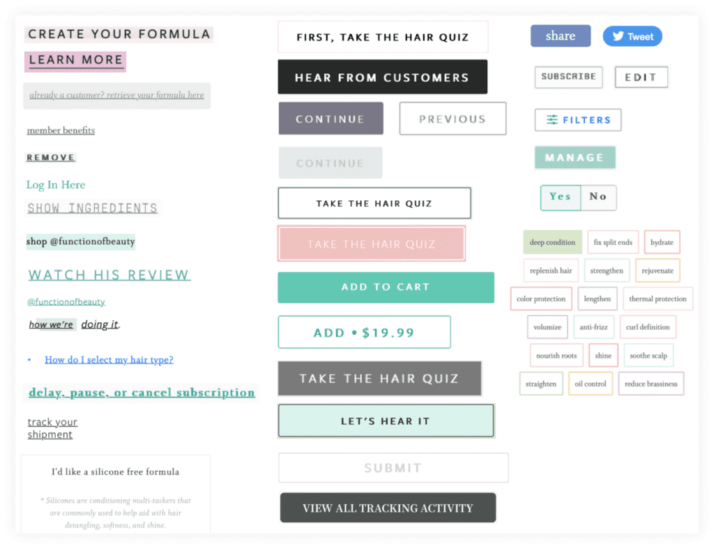
Here’s an example of what was discovered in a UX assessment we completed for Function of Beauty. They’re a company that provides custom haircare products based on a customer’s unique needs.
While analyzing their onboarding and customer account user experience, we created a UI inventory of buttons, and links across the website. As sites grow, it’s common to see inconsistent UI patterns like these emerge.
These inconsistencies create UX friction because the user has to stop and think about the UI while making important purchase decisions, increasing the user’s cognitive load. While it may seem like a minor annoyance in the overall experience, friction like this adds up. Think of it as “death by 1,000 paper cuts.”
Equipped with this holistic assessment, you’ll have a shared understanding of the strengths and shortcomings of the product’s UX and where more focused analysis is needed. With this knowledge, the next step is to move into moderated usability testing and session analysis.
The output of the usability evaluation gives you a baseline understanding of the product’s overall experience. Some of the insights from the evaluation will be easy fixes; for example, UI issues like button naming conventions or call-to-action placement on a screen. However, other insights will require session analysis, a deeper investigation involving observation of users as they navigate the product.
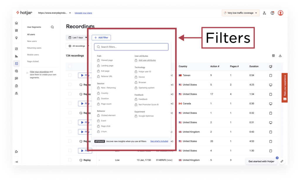
Session analysis requires software that records user behavior. We recommend using HotJar or FullStory since they are more user experience-focused tools. Once the software is installed and recording sessions, you can create user segments focused on screens and devices that you have a hunch, from the evaluation, are challenging experiences.
You can create these segments using the filters available in your session analysis software. For example, on the Recordings tab in HotJar you can easily filter your site recordings by path, session, technology, behavior, and custom user attributes, along with NPS feedback and experiments using Google Optimize.
Now, it’s time to start watching! While you watch users interact with the UI, look for consistent behavior patterns that don’t align with what you expect users to do. For example, are your customers:
- Regularly abandoning a flow to find critical information elsewhere.
- Continuously clicking back after completing part of a flow.
- Repeatedly scrolling up and down before completing forms.
- Overlooking buttons and necessary instructional copy when completing a task.
In addition, you want to ensure no other factors inhibiting the user from completing a flow, such as browser-specific bugs. Finally, after watching enough sessions, you can derive insights from repetitive behavior patterns that customers typically can’t articulate themselves.
These behavioral clues are the starting point for deeper research, such as digging into website analytics or as a basis to probe in unmoderated or moderated usability testing. The goal is to understand if there is a clear “why” behind those behaviors that can be used for design recommendations.
3. Moderated Usability Testing: Learning How Users Think
Now that you’ve completed the baseline evaluation and used session analysis to dig deeper into on-site user behavior, you’re ready to conduct usability testing. Moderated usability testing brings together what customers are doing on the website while describing why they are doing it. This testing method involves individual live sessions where you actively participate using an observation + interview approach, allowing you to ask follow-up questions in real-time.
Before starting the testing you need to design discrete tasks and flows based on the behavior patterns you saw in the session analysis. For example, you might want to learn the following:
- What are their perceptions and actions as they navigate?
- How do they interpret messaging and instructions?
- Where do they see value in the product?
- How does the product meet or not meet their needs?
- What are their expectations as they interact with the website?
- Are there questions the website experience hasn’t answered?
Then, based on your target audience, recruit participants who can give you a fresh perspective as first-time users. Or, you can recruit internally with your existing customers who can shed light on their ongoing experience with the website. Potentially giving you insights into retention.
During the test, participants will talk through what they are experiencing in their own words as they use your product, giving you a rich picture of their motivations, expectations, impressions, and unanswered questions.
You’ll hear their sighs and frustrations and learn what they think of the product. These focused sessions with users provide invaluable context to behaviors discovered in session analysis or potential UX friction called out in the evaluation.
Synthesizing the Data & Prioritizing Improvements
After completing the research, you can start reviewing and organizing the data. During synthesis, it’s important to ask the following questions:
- What underlying issues does the site UX have?
- What type of workarounds are customers using?
- Are there areas of confusion within the core flows?
- What customer needs are not being met by the current experience?
The answers to these questions will emerge as you dig deeper into the data. You’ll start to see common patterns and be able to identify emerging themes. With this triangulated UX assessment approach, you’ll have indispensable insights into how customers experience your product.
For cross team alignment it’s important that the assessment output includes a rich set of video clips, customer quotes, and annotated screenshots. The next step is prioritizing UX improvements, not solutions, that will have the most impact on your site metrics. Consider breaking up your recommendations into three buckets:
UX Quick Wins
We define quick wins as UX improvements that don’t require discussion or iteration. For example, simple usability updates, browser bugs, or inconsistent messaging across the website. They’re straightforward fixes that are a significant first step toward improving the product’s overall UX. Plus, because they’re quick its a fast and easy win for the team.
Experiences With UX Complexity
This is the next level of UX design. It includes updates to the existing experience that require more iteration and discussion than quick wins do. The updates can range from building new features to retooling confusing workflows.
Experiences That Require Discovery and Strategy
Some UX improvements necessitate new experience design. Creating these experiences — and creating them well — requires discovery and strategy work. Your team needs a sense of how the current product can support future design.
Team Up with User Experience Experts
Everyday Industries has conducted countless UX assessments that have led to redesigns that increased conversion and retention metrics. So recommit yourself to your digital product and consider adding us to your team in the new year.