![]()
Since 2015, Function of Beauty has created customizable beauty products. Customers answer a few questions to create products tailored to their hair type, goals, color and fragrance. Function launched with shampoo and conditioner, then grew its product offering to include hair styling, skin, and body care products. However, their site experience didn’t reflect the expanded offerings.
Before entering into a complete website redesign, the Function team consulted with us to create a strategy that would improve customer conversion and retention. Our UX assessment identified current issues and opportunities and paved the way to a more seamless personalized experience.
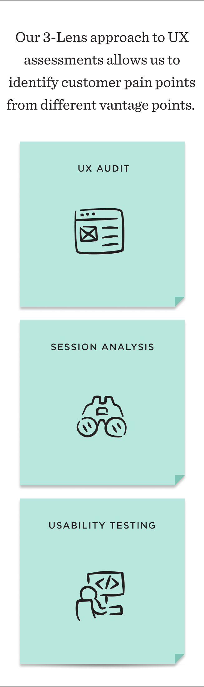
To create a strategy that would be impactful for conversion and retention, we assessed both the shopping and account experiences. Our UX assessments are unique in that they consist of 3 parts: a UX audit, session analysis, and usability testing. These three lenses create an in-depth analysis of customer needs across the experience.
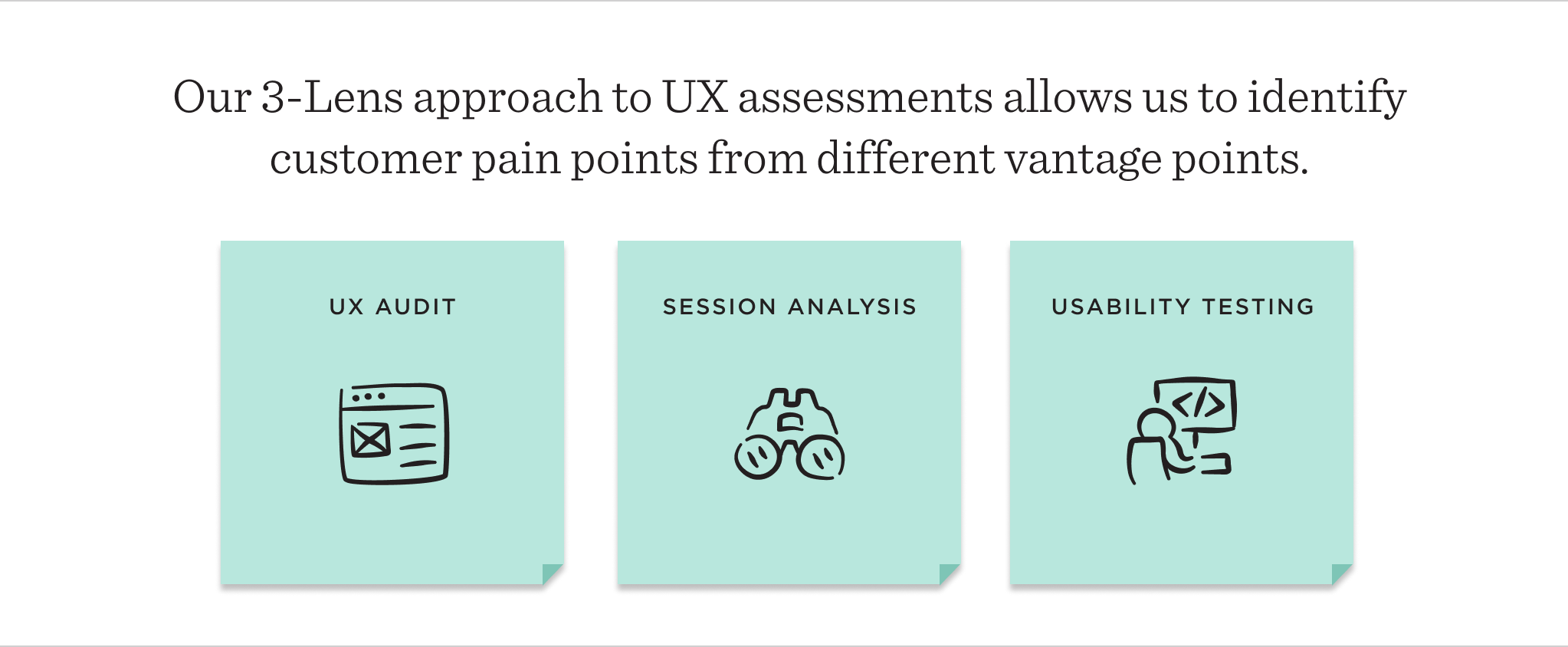
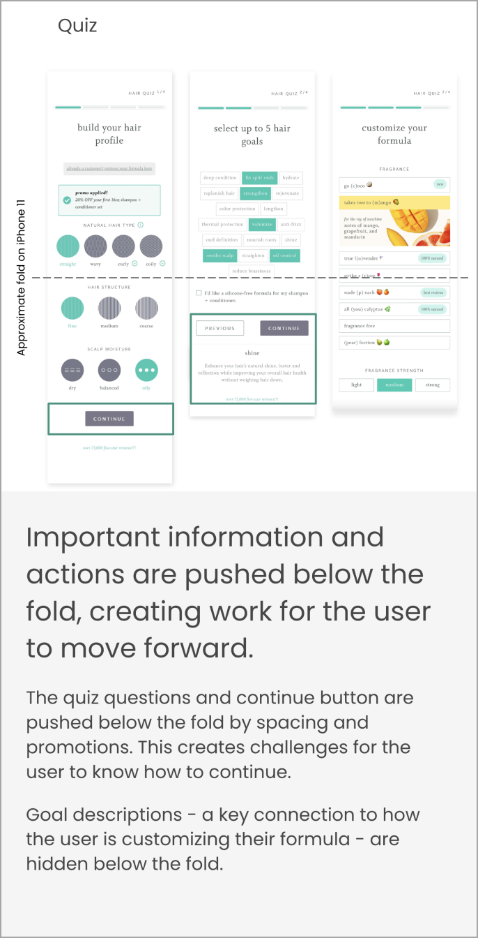
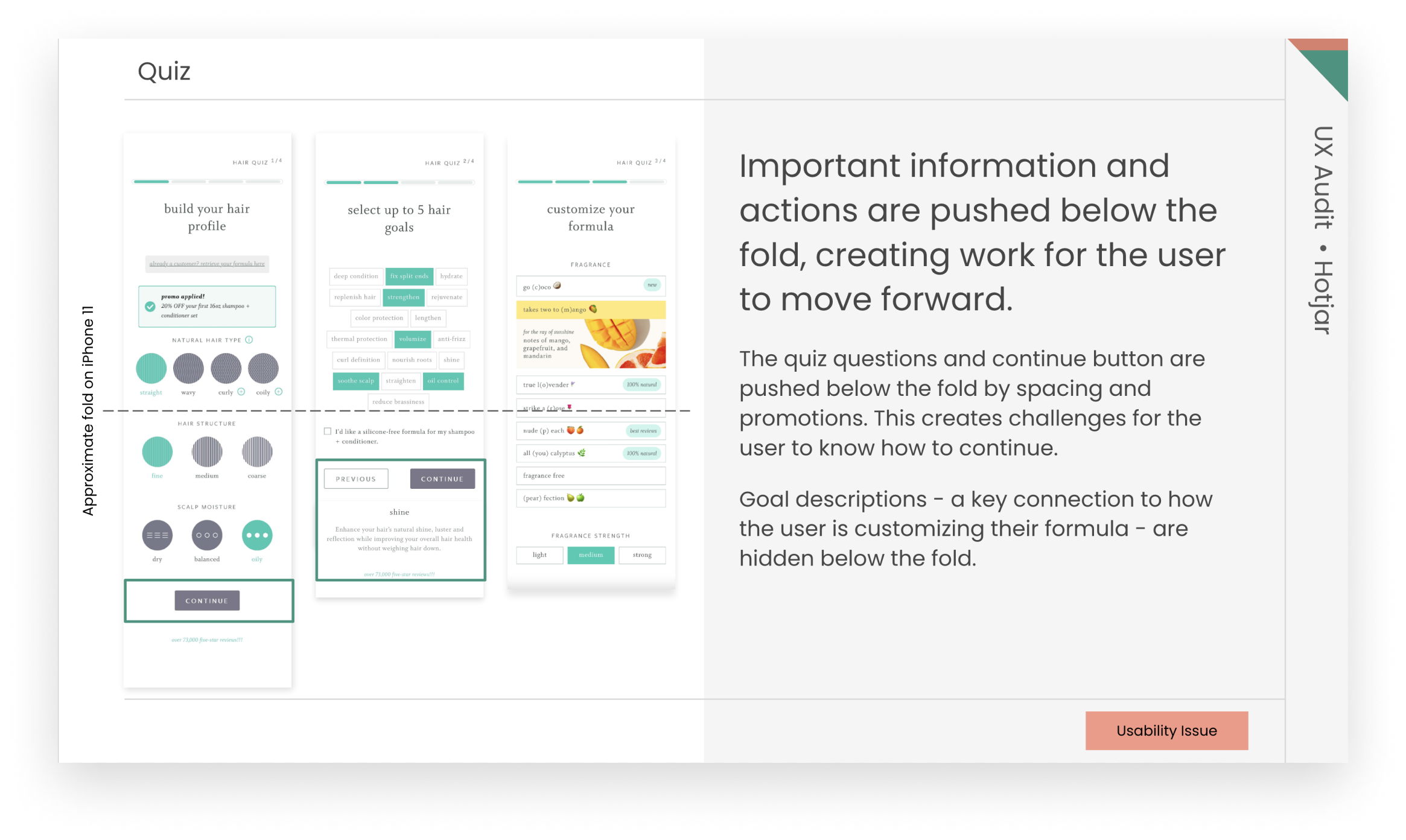
In the UX audit, we looked holistically across Function of Beauty’s website, examining each screen within the conversion funnel, particularly the onboarding hair quiz. Through this process, we identified areas within the experience that could benefit from personalization quiz best practices and usability standards to reduce complexity and provide consistency across the site.
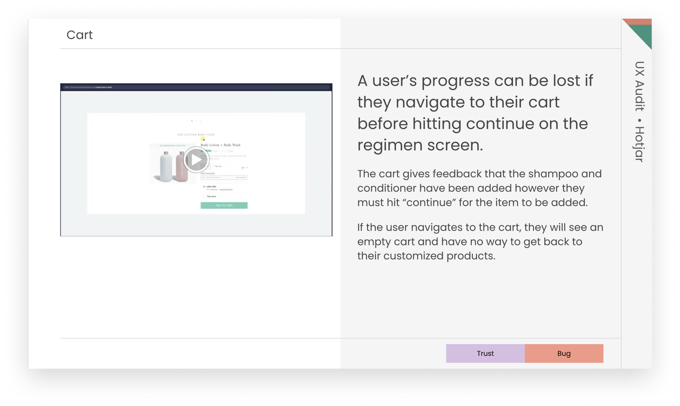
During session recording analysis, we watch recorded sessions as customers use the site to customize their products, checkout, and manage their accounts. We discovered points in the flow where users experienced errors and moments of confusion. Other sessions revealed users hesitating over selections and struggling to find information about how products are personalized to their needs.
The session analysis pointed to clear opportunities to fix bugs, make small UX changes, and prioritize more significant changes that helped focus the shopping experience by providing the information customers needed earlier in the flow.
For usability testing, we launched two studies to focus on the different customer needs for conversion and retention. For conversion, we captured how new customers experienced the flow: from customizing products and viewing results through to checkout. For retention, we focused on existing customers who showed us how they manage and adapt their subscriptions.
The learnings from the usability studies brought important customer perspectives to our assessment. New customers needed guidance to help them choose the right options to customize their products. A stronger connection between their selections and the final personalized product was also missing. More information about complementary products to help reach their goals rounded out the top requests.
I don’t see anything about what the subscription requirements are. How often would it come? And, what is the cancellation policy?
I don’t see anything about what the subscription requirements are. How often would it come? And, what is the cancellation policy?
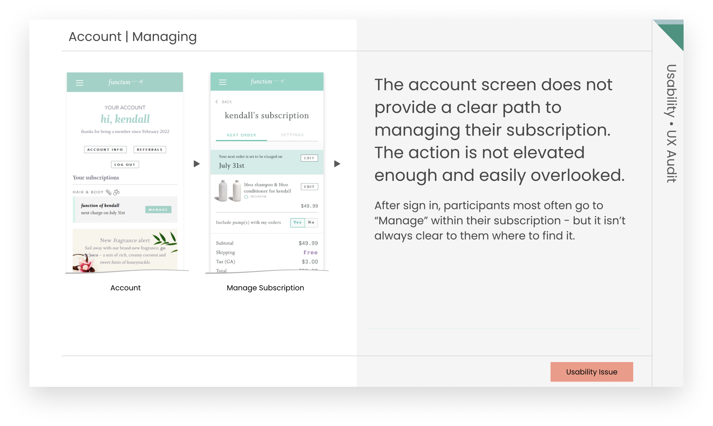
Existing customers also had unique needs. They wanted a more streamlined account management experience where they could make subscription changes without navigating deep into their account settings. They showed us the primary ways they use their account, which helped shape a new information hierarchy.
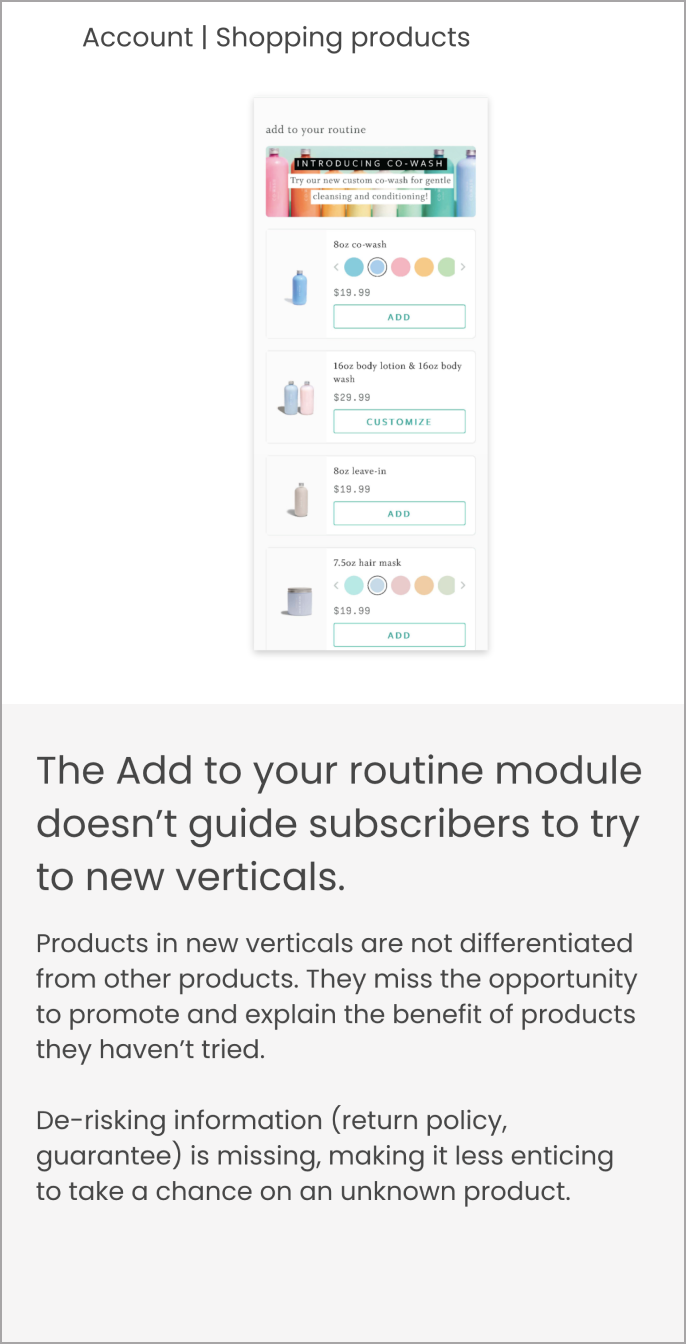
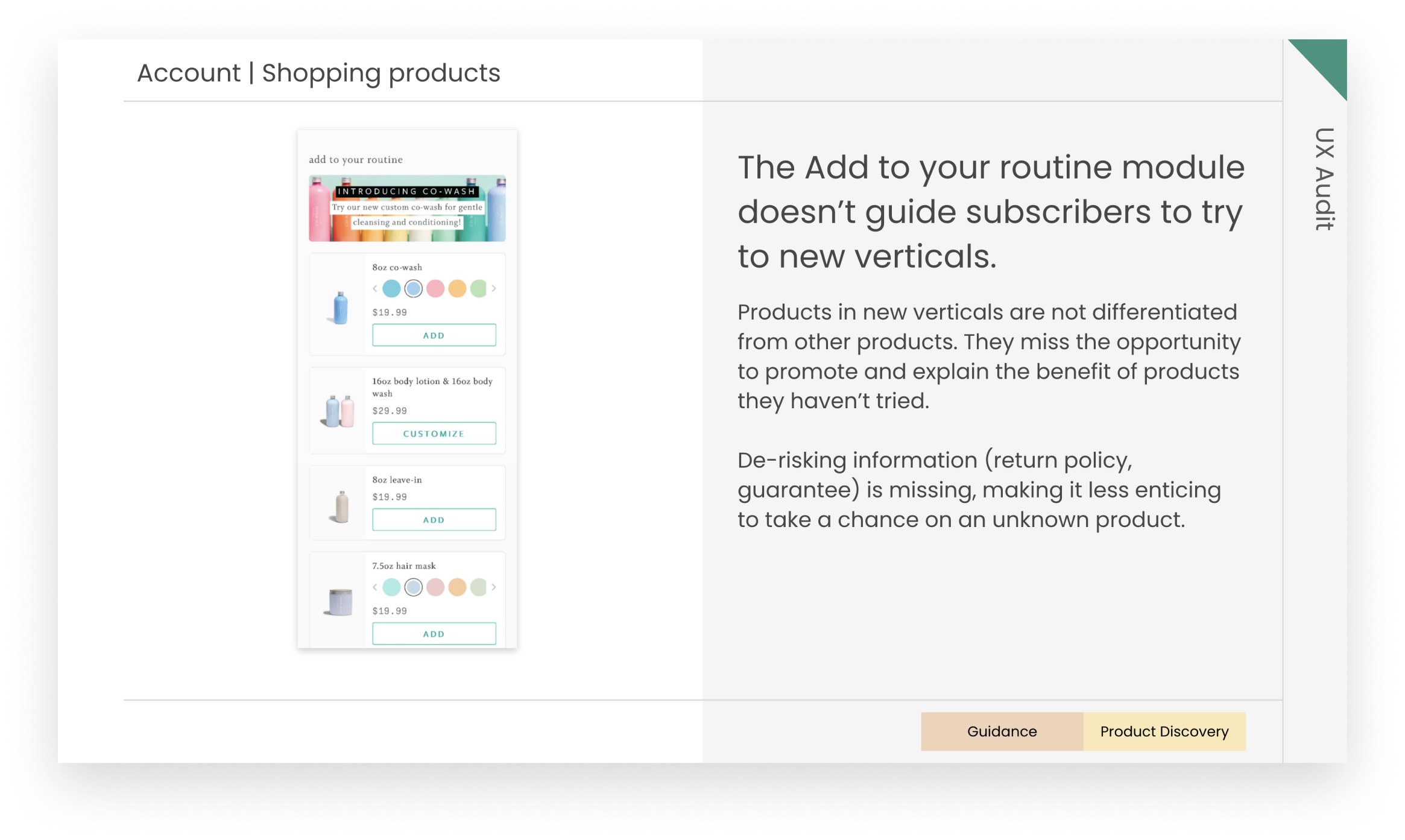
Subscribers also wanted to discover new products that could complement their routine; however, the current account experience limited exploration, forcing them to exit their account to explore new products.
The assessment created a holistic view of UX friction, information needs, and opportunities across the site. Opportunities were prioritized by effort, giving the team a clear roadmap for the redesign. We designed concepts that explored new ways to shop based on the findings from the assessment.
The strategy stayed grounded in assessment data. That focus directed attention to the changes most likely to move conversion and retention. The redesign gave customers a clearer picture of the full product range and how each item is personalized. It also delivered a streamlined checkout and a focused subscription management experience.
We work as an extension of your team, bringing UX thinking, rapid prototyping, and iterative design from early research all the way to development-ready designs.
We help teams design AI-powered products that users trust. From interaction design to AI UX, we help make complex, variable AI behavior feel intuitive and human.
We evaluate your product with the same critical eye your customers bring, with the design vocabulary to explain what's working, what isn't, and what to do about it.