Design thinking in the Age of AI
AI is transforming how we live, work, and communicate. With AI’s help, we can move from idea to product launch at super-speed. Never before have we been able to move
▪ September 26, 2025▪ September 22, 2023
All your site metrics are pointing upwards. Total Site Visitors. Time on site. Add to Cart Rates. But cart abandonment is an issue. What’s the hesitation?
It’s a challenge that many retail businesses face, a puzzle wrapped in seemingly promising numbers. The influx of visitors to your online store is heartening, and they’re lingering longer than ever, intrigued by your products. The Add to Cart button is getting the attention it deserves. Yet, potential customers hit the brakes somewhere between cart and checkout, leaving abandoned carts in their wake.
It’s like reading the last chapter of a novel, where your curiosity about the conclusion is at its peak. You’re eager to discover the missing puzzle piece, the unspoken hesitation that’s been lingering. You’ve put in the effort to streamline the path to the cart, eliminating UX obstacles in the conversion process. Now, the question is: What might be preventing potential buyers from taking that final decisive step towards checkout?
Before diving into more complex strategies to reduce cart abandonment rates, take care of the low-hanging fruit first—those everyday issues that can be quickly addressed through user interface (UI) improvements. Start with session analysis and a conversion funnel UX assessment, then ensure your shopping cart has all of the following elements in place:
With these basic cart enhancements in place, it’s time to start testing new strategies to help reduce abandonment rates. While purchasing decisions are rooted in needs, it’s natural for customers to hesitate, particularly when faced with specific challenges. Here are some familiar sources of friction that create buyer hesitation and, ultimately, cart abandonment:
Now that we’ve established typical buyer hesitations and foundational cart UI improvements let’s delve into some smart UX strategies that will empower customers to move confidently towards checkout.
We’ve all been there: you’re desperate to find a solution to an immediate need. Imagine your laptop charger has suddenly stopped working, and without it, you won’t be able to meet essential deadlines.
You hop online, find the replacement, add it to your cart, and are suddenly confronted with an estimated shipping time of 5-7 days. The wait makes you hesitate, and after considering the implications for a brief moment, decide to abandon the cart.
Whether customers shop for a laptop charger, children’s clothing, or party supplies, they will evaluate whether the estimated shipping time aligns with when they need the product.
To alleviate the uncertainty associated with shipping times, retailers are including alternative delivery choices in the shopping cart and providing time-specific messaging. This strategy aims to eliminate any hesitations customers may have about estimated shipping times, resulting in a smoother shopping experience and reduced cart abandonment.

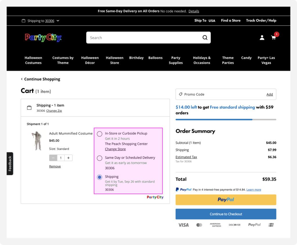
For example, customers can choose from three fulfillment options in the Party City cart: In-Store or Curbside Pickup, Same Day or Scheduled Delivery, or Standard Shipping. They prioritize the options from fastest to slowest and are specific with times and dates. Additionally, they have changed the font color to green to distinguish it from other text on the page and draw attention to the available timeframes:
This broad selection of times allows you to select the shipping option that best aligns with your schedule and ensures your order arrives precisely when it should.
We’ve all faced that moment of hesitation when something we desire collides with a hefty price tag. Let’s paint a picture: You’ve received an invitation to an important event, perhaps a wedding or a gala, and you’re searching for that perfect outfit to make you stand out.
After perusing various online boutiques, you find a dress that matches the occasion. You eagerly add it to your cart, but as you glance at the grand total, which includes the dress, accompanying accessories, and expedited shipping to ensure it arrives in time for the event, you find yourself hitting the brakes. It’s a substantial expense that necessitates a reevaluation of your budget.
This tug-of-war between fulfilling a desire and budget constraints is a common dilemma that shoppers grapple with, whether they’re searching for an outfit for a special event, high-end tech gadgets, or other luxury items. Retailers have broadened their payment options to alleviate the immediate financial burden and push shoppers toward conversion,
This expansion includes branded financing and “buy now, pay later” (BNPL) solutions like Klarna, Affirm, etc. Broadening payment options aims to minimize the hesitations customers may have related to high costs, resulting in a reduction in cart abandonment rates.

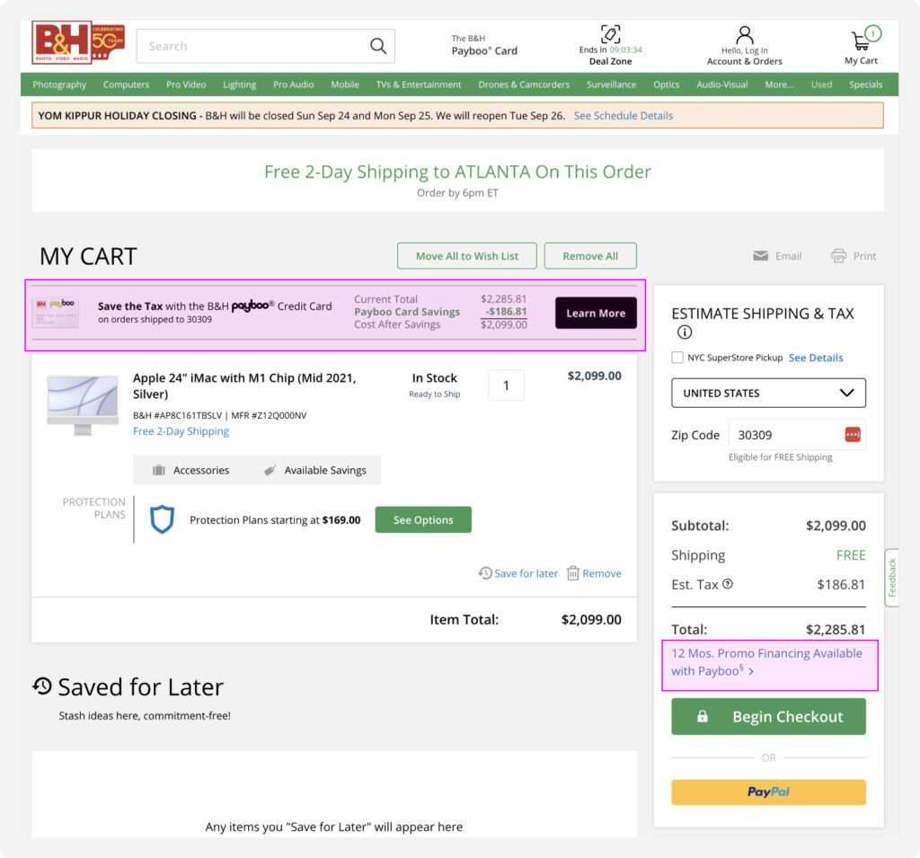
For example, B&H allows shoppers to apply for a branded credit card directly from their shopping cart. To encourage buyers, they showcase exclusive card-related savings and display a revised total cost after these savings, along with a “Learn More” call-to-action (CTA).
Additionally, B&H ensures customers who scroll beyond the initial module are still informed about the credit card option. Below the cart total, a distinct message highlights the option to split the cost over 12 months.
We’ve all experienced this situation: you discover that you’re only a few dollars away from meeting the free shipping requirement, and suddenly, you face a dilemma. You start thinking about whether to complete your purchase or search for an additional item to add to your cart and reach the free shipping threshold.
What should be a straightforward shopping decision transforms into a time-consuming ordeal. You find yourself caught between the desire to cut down on shipping expenses and the uncertainty of what additional item to include in your cart.
Unfortunately, online retailers often fall short when assisting shoppers in this situation. While some cart modules attempt to upsell based on generic personalization with phrases like “You might also like” or “Recommended for you,” the suggested items typically lack relevance to the buyer. Or the items are too expensive solely for reaching a shipping threshold. Consequently, shoppers might abandon their carts and return to browsing, increasing the risk of leaving the website altogether.
Some retailers have introduced bundles within the cart to combat abandonment. Catered specifically to the items in the cart, these bundles enhance the shopping experience, making decision-making effortless and relevance paramount.

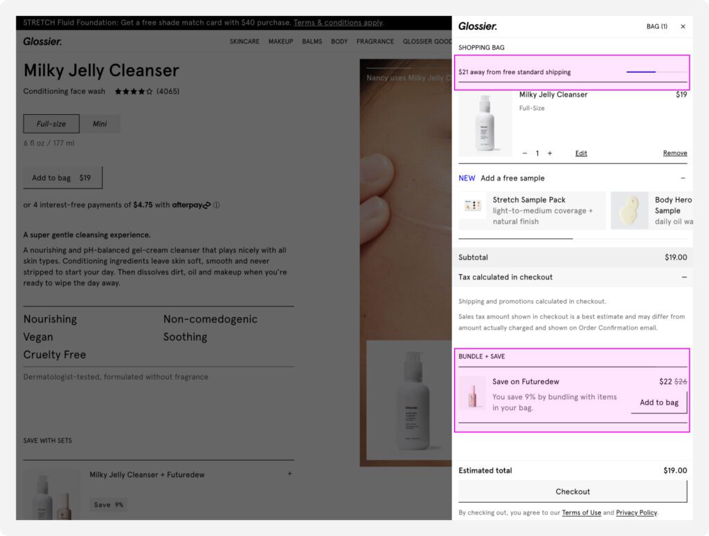
For instance, Glossier, like many other retailers, prominently displays the free shipping threshold at the top of the cart, visually indicating that shoppers are close to qualifying.
To help customers meet the threshold, Glossier includes a “bundle + save” module within the cart. Here, they recommend a relevant product, such as a face serum, to complement a cleanser.
To sweeten the deal, Glossier highlights the savings opportunity, explicitly stating, “You save 9% by bundling with items in your bag,” and displaying the original price with a strikethrough.
This simple messaging not only pushes the customer over the free shipping threshold but also lets them feel like they’re getting a great deal. The “Add to Bag” button keeps the customer in the cart, curbing their tendency to browse elsewhere and reducing the likelihood of bouncing.
You’re reviewing the items in your cart and deciding what to keep and remove. Then, while deciding on a shirt, you experience the same hesitation you had when looking at the product detail page (PDP): I like the slate colorway more than the turquoise. So, you decide to update the color. You click on the item, your cart closes, and the shirt PDP opens.
What should be a fast decision turns into a time-consuming process. You’re forced to go to a new page to add the item with the colorway you want, reopen the cart, remove the old item, and review cart details before checking out. Many micro-decisions are forced on the user across multiple pages, which can quickly lead to decision fatigue and cart abandonment.
Unfortunately, online retailers rarely provide in-cart UI to help users finalize decisions in the cart. Instead, they interrupt the top of the conversion funnel by pushing the user back to browse pages to change product attributes. Adding editable product attribute functionality directly within the shopping cart streamlines the shopping experience, making it more convenient and efficient for customers.

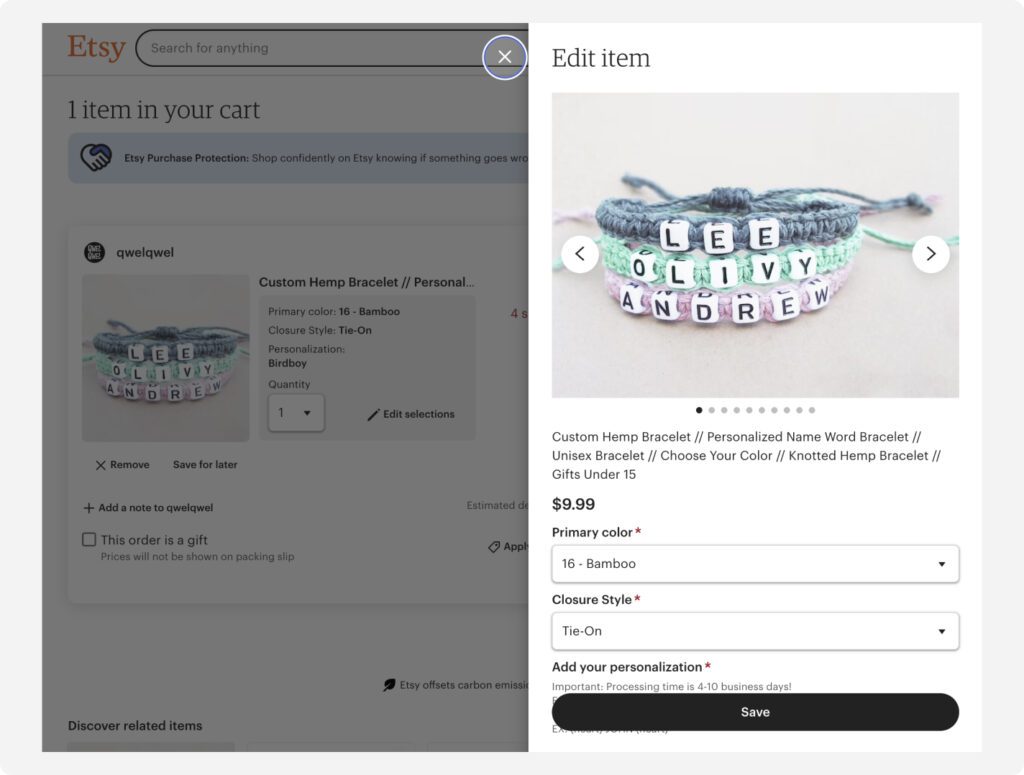
Etsy allows customers to adjust product attributes like color, size, quantity, or customization options within the cart. This saves time and minimizes the risk of shoppers becoming tired or frustrated when navigating a complex marketplace to adjust a colorway or misspelled name. This ultimately increases the likelihood that they will complete their purchase without abandoning their cart.
Another UI option that can help with decision fatigue is allowing users to move items to a favorites list in the cart instead of removing them entirely. Favoriting does add another decision point. But, it enables the user to quickly put the product aside for later versus making the binary decision to keep or remove it now.
In eCommerce, every click, hesitation, and decision counts. By understanding the psychology of cart abandonment and implementing savvy strategies, retailers can turn those abandoned carts into thriving conversions. From offering personalized bundles to smooth payment options, the path from cart to conversion is paved with customer-centric solutions.
So, as you navigate the ever-changing landscape of online retail, remember that it’s not just about products; it’s about the experiences and choices you provide to your customers. By doing so, you’ll not only reduce cart abandonment but also nurture lasting customer relationships and drive your e-commerce success to new heights.
Learn how Everyday Industries can deliver the customer-centric insights you need to build better digital experiences and drive business growth.
AI is transforming how we live, work, and communicate. With AI’s help, we can move from idea to product launch at super-speed. Never before have we been able to move
▪ September 26, 2025In product design, few phrases are as common, or as unhelpful, as “it needs more visual polish.” You’ve heard it in critiques, design reviews, Slack threads, and launch meetings. Everyone
▪ August 22, 2025Most progress dashboards in EdTech leave parents to interpret charts and scores on their own. Generative UI offers a more meaningful alternative by translating student data into clear, contextual narratives.
▪ July 7, 2025