Design thinking in the Age of AI
AI is transforming how we live, work, and communicate. With AI’s help, we can move from idea to product launch at super-speed. Never before have we been able to move
▪ September 26, 2025
![]()
▪ February 25, 2022
Change is hard. Reluctance to accept even beneficial change happens to the best of us because we’re creatures of habit. And it can happen to your customers when you decide to roll out a new and better design in the name of improvement.
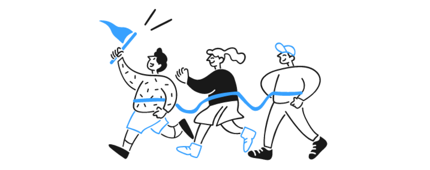
Launching a new design for your product can be a harrowing change for many of your customers. All of a sudden they have to access to their purchase history through their account instead of finding it in their go-to, round-about way? No way, that’s crazy! Or, so they may feel…
Here’s the thing: You know your new design offers them a higher-quality experience. You just have to plan your rollout to make it obvious to them. Do it right and you’ll not only decrease the bits of backlash but gain higher rates of retention.
Like other aspects of your product’s design, it takes a user-centered approach.
The navigation has changed! My information isn’t where it used to be! You took away the feature I was using!
To your customers, the new design solutions you just implemented (that solve major issues!) may not be the first thing they notice. You changed the design they knew and they don’t like it. Plain and simple.
It doesn’t matter that your new and improved updates meet your customers’ needs like never before; your customers had made a habit out of using the old design. They developed workarounds to complete tasks and achieve their desired outcome within your product. It wasn’t an ideal way to get things done, but it’s what they were used to.
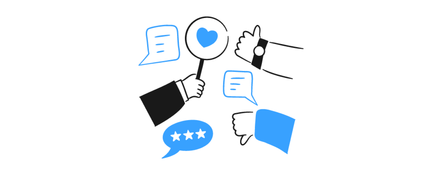
Their criticism may be hard for your team to hear. But it’s important to embrace the feedback, tease out the constructive comments, and find out where it all stems from.
It may be an emotional reaction to the change (thanks to status quo bias). Or, it could be a legitimate issue that was overlooked in testing.
Either way, planning for your rollout to reduce customer pushback can help in two ways.
You may find more of the critical, emotional feedback comes from existing customers. New customers don’t have the same frame of reference for using your product. Any feedback that comes from that group is likely more about the design’s functionality and any outside expectations they are bringing to the experience.
So what do you do to combat the backlash — or, better yet, avoid it altogether?
Simple: Focus on the rollout of the new design as an extension of the new design itself.
That means putting yourself in the customer’s shoes to find out their current behaviors and what they need to know.
Practicing empathy for your customer about the changes coming their way lets them know you’re designing the experience with them in mind.
You may not eliminate all emotional backlash the first time you roll out your new design. That’s okay. The point is, keep listening, learning, and iterating.
Here’s how.
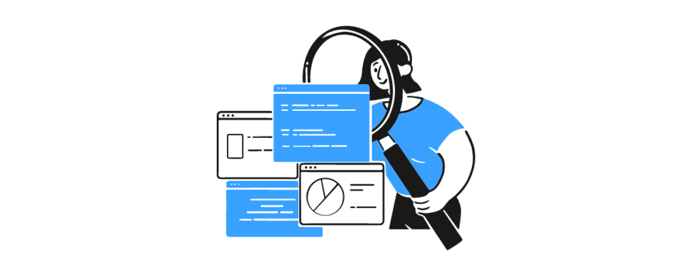
Step 1: Get a temperature check with pre-rollout usability testing
Just like conducting usability testing in the design process, you’ll want to apply usability testing to your rollout with existing customers. This is an important preliminary step because it allows you to assess your customer’s expectations around the new design and anticipate any points of friction.
Meet first with your team and brainstorm any frustrations you think will bubble up for your customers. Use the research to explore these fears and hypotheses, uncovering if they are true roadblocks for customers or if your concerns are (happily) unfounded.
When it comes to your usability research, look to answer these questions through the lens of your customer:
Let your research guide how you plan your rollout. For example, if you sense a point of friction but you’re confident in the benefit, you’ll know that’s something to address clearly in the rollout.
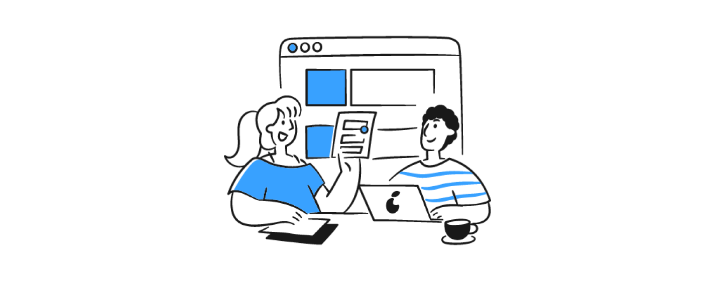
Step 2: Design the UX to guide them
If you’re tempted to just create an onboarding tutorial, hold off. Customers will most often either skip over it or forget the information altogether. Plus, a tutorial creates more work for them to go through before jumping in to use the product.
Instead, anticipate areas of confusion or frustration (lookin’ at you, research findings!). Take a second look at design opportunities that would make the transition from old to new, easy and intuitive. This can happen through design cues and guidance. And here’s a hint: the sequence and order of how to introduce new changes and features are just as important as the new design.
Other tips to make your UX do the heavy lifting:
Step 3: Put the new design benefits front and center
You get one shot to educate your customers about the advantages of your new design before they even have a chance to object.
Customers need to understand the “why” behind the redesign and how using it enhances their experience. If they do, they’re less likely to abandon you for another product.
This means highlighting the improvements from the very beginning.
Here are three ways you can make your benefits impossible to miss:
Step 4: Launch, listen, and learn.
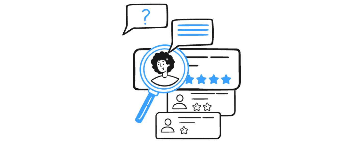
Though launching a new design with a thoughtful rollout is cause for celebration, your work isn’t quite over. You need to listen to feedback to see if the user-centered rollout was a success – or if you still have room for improvement.
As you receive user feedback through customer support, surveys, or product reviews, keep your ears open. Try to distinguish the type of feedback you’re getting between challenges that are unique to existing customers, new customers, or both.
You could uncover problems with the product itself – namely the UX, usability, or functionality – for both new and existing customers. This could be a case if new customers are not sticking with the updated product after conversion. Or, it could be that existing customers can’t complete a task as they did in the previous version, maybe because a particular function was removed or adjusted.
On the flip side, you could learn about issues stemming from the transition to the new design. This could look like existing customers asking how to complete tasks as they did in the previous version because that aspect of the design has changed.
Decreased engagement with a certain feature could also be a point in the ‘Transition Issues’ column.
To get deeper insight around engagement levels, look to key resources:
If it’s technically possible, begin the rollout of the design with a smaller subset of customers (for example, 10%) and gauge the impact without going full scale. That way, you could nip some issues in the bud before opening the floodgates of feedback.
Lastly, listening to feedback may help uncover some overlooked use cases. Maybe you made a change based on customer feedback, but it created a different unanticipated challenge for a different user or use case. Giving credence to this information is an opportunity to explore new solutions with more context.
If you find you still have a lot of feedback in the areas of “Transition Issues” start from Step 1: get a temperature check with your customers on the new design. The more you listen and learn, the better your results will be.
As you prepare to wow your customers with a new design that adds more value to their experience, do what you’ve always done: Consider their perspective.
Everyday Industries is a UX strategy and digital product design firm. Learn how our UX research services can help ensure your product experience resonates with your customers and drives business growth.
AI is transforming how we live, work, and communicate. With AI’s help, we can move from idea to product launch at super-speed. Never before have we been able to move
▪ September 26, 2025In product design, few phrases are as common, or as unhelpful, as “it needs more visual polish.” You’ve heard it in critiques, design reviews, Slack threads, and launch meetings. Everyone
▪ August 22, 2025Most progress dashboards in EdTech leave parents to interpret charts and scores on their own. Generative UI offers a more meaningful alternative by translating student data into clear, contextual narratives.
▪ July 7, 2025