A UX Evaluation: Ray-Ban Stories Smart Glasses
UX Deep Dives By Brittany Luby ▪ November 11, 2022
My first glimpse into smart glasses was about five years ago, watching a snap of my friend biking along the Hudson in NYC. I became instantly enamored with the idea of being able to experience someone else’s perspective without actually being there. I finally took the plunge myself with the recently released Ray-Ban Stories smart glasses, which capture both film and photography.
First Impressions: A Seamless Onboarding Experience
I was already elated to receive my first pair of smart glasses, and a simple onboarding experience made it that much better.
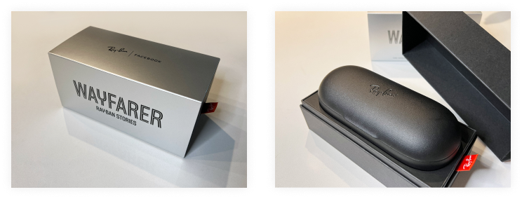
The unboxing experience felt very luxe, with a gleaming silver belly band and a case that opens up from the middle, making it feel like you’re opening a present.

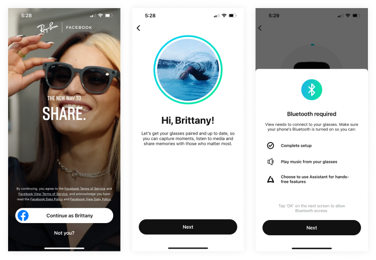
Inside was a barcode to scan and download the Facebook View app, which begins the quick and seamless onboarding process. The app immediately recognized my Facebook account, allowing me to set up my glasses with that profile. Doing so meant I didn’t have to add any additional personal information in the onboarding process.


Learning the Ropes: Interacting with New Controls
Now it was time to figure out how the glasses worked. In total, there are three simple controls that all work with a single touch. First, the power switch serves three functions with different interactions:
- Turn the glasses on
- Turn on pairing mode
- Pair the glasses with your phone
Next, the audio control is a touchpad on the right endpiece that can start, pause, or skip a song by tapping once and adjusting the volume by sliding up or down.

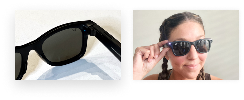
The most important control, located above the audio control on top of the endpiece, is the button that allows you to take a picture or video. To take a photo, you press and hold the button for a few seconds until you hear a “capture” sound. You press the button once to record a video, which starts a 30-second recording. Or, if you want the video to be shorter, you can tap the button a second time. An external facing light flashes while the glasses are recording, so people around you know you’re taking a photo or video.
Putting the Ray-Ban Stories to Work: Capturing & Saving Content
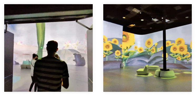
Once I had finished the setup and the basic functionality felt familiar; I put the glasses to a real-world test at an art installation near my apartment. Using the glasses at the art installation highlighted some great features while exposing aspects of the experience that could benefit from refinement.
So let’s start with what I loved about the experience!
Being fully immersed: Ultimately, the Ray-Ban Stories glasses deliver on the promise I was most excited about —- the ability to stay focused on being immersed in an experience instead of hiding behind a viewport trying to capture the moment. The camera automatically adjusts to surrounding light to ensure high-quality photos and videos are captured, enhancing the experience of sharing them with others. Below you can see photos from my perspective of the art installation.

Deeper functionality: The glasses also have unanticipated functionality that provides other ways to use them. Built-in sound and speakers make them easy to wear on a walk while listening to music or making a phone call.
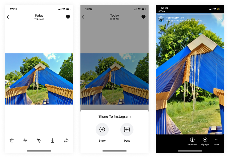
It’s all in the details: A novel and fun feature of sharing was a “Captured with Ray-Ban Stories” caption on images posted to Instagram stories. The caption prompted friends to message me about the experience.
Here are a few aspects of the experience that could benefit from refinement.
Sharing photos: Sharing my captured pictures from the app directly to Instagram was straightforward. However, when I went to post a photo to my Story, it was in a horizontal format, with a large portion of the top and bottom screen appearing as negative white space. Further investigation revealed that there is no way to change the orientation.

So I either had to crop extremely far in on a photo to create a vertical orientation or get into the habit of always standing at least 10-15 feet back so I could crop the pictures without losing my intended framing. I ended up doing the latter; however, this took away from the experience of capturing the moment from my perspective to share with others.
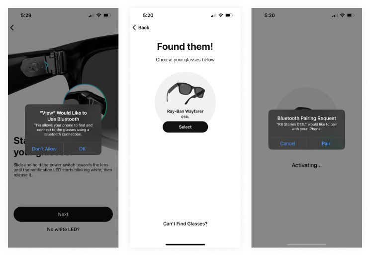
Downloading content: Once you are ready to download your content, you must tap through a few dialogs, such as agreeing to join a BlueTooth network. After tapping through the dialogs and joining the BlueTooth network, you have to tap download a second time, adding friction to the content download experience.
App Update: Connection Issues & A New Story View Feature
After getting a new iPhone, I encountered issues getting my smart glasses to pair with the BlueTooth network required within the Facebook view app. However, it was easy to get in touch with a customer service agent, without a wait or hold time, who immediately knew the solution: a simple factory reset. To perform this, I pressed and held the power button and capture button until the indicator light turned orange. Once I did this, I could pair my smart glasses to my phone without any issues.
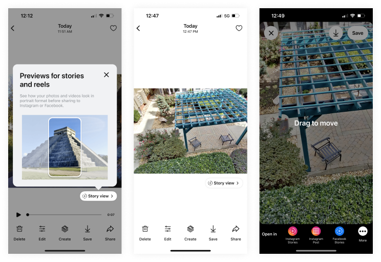
The Facebook view app then prompted me to install an update. This update came with many great new features, including one, in particular, I had been alluding to earlier. The “Story View” feature lets you preview your photos and videos in portrait format before uploading them to Instagram Stories.
While everything was running smoothly after the update, one thing quickly became clear—scrolling, uploading, and previewing content so seamlessly also means staying mindful of digital safety. Public networks and unsecured connections can quietly expose more than intended, especially when you’re frequently sharing media or accessing apps tied to personal accounts. This is where tools such as Instagram VPN by Browsec come into play, offering an added layer of protection while you browse, post, or explore new features. With a secure connection in place, the experience remains just as fluid, only now with the reassurance that your data isn’t wandering off unattended.

Although this did not solve the overall orientation issue of the glasses capturing images and videos in a horizontal format, the ability to preview the image in portrait format within the app before uploading to a social platform provided a better experience.
Evaluating the Overall User Experience
From a design perspective, the glasses were an exciting exploration in multimodal user experiences, stepping into new territories in connected devices and content sharing. Using them highlighted the importance of thinking through the entire customer journey, from product discovery to conversion to unboxing and onboarding, how content is captured with the device, and how content is shared on a social platform to ensure consistent format and ease of use.
While I appreciate the main benefit of the Ray-Ban Stories glasses, some minor refinements could drive home the product’s value. For example, despite the ease of initial onboarding, I found it challenging to pair my glasses when I got a new phone, requiring troubleshooting. In addition, the inability to change the orientation of the photo or video was a surprising drawback — the product name “Ray-Ban Stories” gives the impression that the glasses create content in a mobile-friendly format allowing for seamless integrations with social platforms.
The Ray-Ban Stories smart glasses were enjoyable to experiment with, not to mention stylish too!
Tinker & Explore: UX Evaluations of New Products & Services
At Everyday Industries, we’re curious about how new technologies and services shape our experience of the world. So, we created a program called ‘Tinker & Explore,’ where we experience and evaluate new products or services through a UX lens.
Our other UX evaluations include:
- WHOOP Health & Fitness Wearable: A band that tracks fitness and sleep data to provide recommendations for optimizing performance, sleep, and overall well-being.
- Forward Health: A personalized primary care service that combines advanced technology and data with doctors to help you monitor and guide long-term health.
- Levoit Air Purifier, Humidifier & VeSync App: Smart home products that connect to an app allowing you to monitor and manage your home’s air quality and humidity.
We use these UX evaluations to be thoughtful about the experience design. We are always open to feedback and would love to have a conversation, so don’t hesitate to contact us if you have any questions.

