Design thinking in the Age of AI
AI is transforming how we live, work, and communicate. With AI’s help, we can move from idea to product launch at super-speed. Never before have we been able to move
▪ September 26, 2025▪ March 18, 2022
Your customers have unwrapped the beautiful packaging and powered on their new smart product. What happens in the next few moments is critical: companion app onboarding.
The onboarding experience is your chance to educate your customers on navigating their new favorite product. And this first impression could make or break how they feel about purchasing it altogether.
Too often, smart product onboarding is a complex, convoluted user experience. Whether the information is presented overwhelmingly or completing the steps takes too long, an onboarding process that feels unclear and arduous can leave a negative impression.
Instead, give your customers the right onboarding experience that leaves a lasting positive impression long after they’ve recycled the box.
Your job is to make the onboarding user experience an enjoyable part of the product. Doing this means thinking about all the details your customer needs to know and leaving out everything they don’t.
To get started, prioritize every must-do your customer needs to complete for proper onboarding. This may include:
As your team prioritizes the must-dos, consider how your customers’ context (their physical location and interaction with the connected product) might affect their onboarding experience.
Begin by gathering the usage requirements of your smart product. These are the interactions a customer should follow for the product to work correctly. For example, if your product is a compact medical device, does your device:

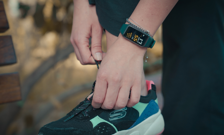
If your smart product is something, someone wears, like a health tracker, think about how, what, when, and where they will use it. For example, does your customer need to know your wearable product is:
If your smart product needs specific conditions to work correctly, think about how to notify your customer when elements affect how the product works (or is not working).
Documenting your must-do tasks and contexts before design will ensure that you leave nothing critical out that could derail your customer’s experience.
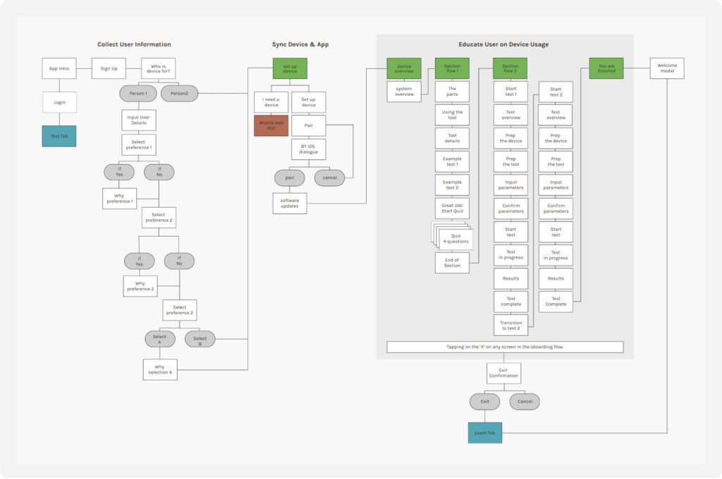
Now that you have your prioritized list of must-dos and customer contexts, next up is choreographing the overall experience. Create a diagram identifying what tasks or educational steps need to happen and when.

For example, does your customer need to answer onboarding questions that personalize the user experience? Or does the customer’s first interaction require a Bluetooth connection before proceeding? In the above flow example, the onboarding is broken up in to 3 key sections: collect user information, sync device & app, educate use on device usage. Within each of these sections there are multiple sub-flows that guide the user to successful usage of the smart product.
As you create your workflow diagram, identify where you can streamline the user experience by removing or combining information into more consumable chunks. Not only is this important for simplifying the overall onboarding process, but it’s also critical in keeping your customer’s attention.
Does your customer have to pick up their phone, put it down, do something with the device, and repeat? If the onboarding process requires too many steps, you’ll complicate the user experience and frustrate the user, leaving them with more questions than answers.
To ensure your onboarding process isn’t too complex, have your team test the experience using a wireframe prototype, paying attention to each touchpoint. Then, Then, when you have a functional prototype, conduct usability testing with potential consumers.
Even if you don’t have a production-ready product, you can learn what areas of your onboarding UX require refinement. You can then adjust the design to improve the experience and retest.
Teaching your customers how to navigate your product can be tricky. You want to educate them so they feel confident and comfortable, but you don’t want them to get bored or confused. The trick to avoiding this? Don’t design a homogenous educational experience.
Each customer is different, and they will learn in their own wonderfully unique way. Not only that, but they will interpret information differently from the next customer.
To make your onboarding user experience helpful and pleasing to all, think outside the wireframe and consider ways to educate them that resonate.
Some customers prefer to read all the instructions before touching the device, while others may opt to learn on the job and skip over instructions altogether. Either way, designing your educational elements with these diverse learning styles ensures everyone’s style is entertained.
Beyond creating a simplified, easy-to-understand onboarding flow, don’t miss chances to delight your customers and leave them feeling excited about their purchase.
To do this, consider the peak-end rule, where people remember intense positive or negative moments (peaks) and the last moments of an experience (end) rather than the sum of the entire experience.
To use the peak-end rule to shape a fantastic experience, include the following in your design:
As you work on the physical design of your IoT device, ensuring your companion app and onboarding experience are top-notch is one of the most important things you can do for customer satisfaction.
Consider engaging an outside design agency to make your connected product as helpful, easy to use, and enjoyable for your customers as possible. When your team is so focused on making every aspect of your product’s experience the best it can be, collaborating with a design agency specializing in app design can be a relief — and competitive advantage.
At Everyday Industries, we’ll work with you to conduct a strategy session to figure out what’s needed where. Next (in a nutshell), we’ll map out the customer journey, design the user experience, draw the high-fidelity wireframes, create pixel-perfect screen design using your brand guidelines, and test (and test and test) the design until it’s ready to wow. It’s what we love to do.
AI is transforming how we live, work, and communicate. With AI’s help, we can move from idea to product launch at super-speed. Never before have we been able to move
▪ September 26, 2025In product design, few phrases are as common, or as unhelpful, as “it needs more visual polish.” You’ve heard it in critiques, design reviews, Slack threads, and launch meetings. Everyone
▪ August 22, 2025Most progress dashboards in EdTech leave parents to interpret charts and scores on their own. Generative UI offers a more meaningful alternative by translating student data into clear, contextual narratives.
▪ July 7, 2025