Design thinking in the Age of AI
AI is transforming how we live, work, and communicate. With AI’s help, we can move from idea to product launch at super-speed. Never before have we been able to move
▪ September 26, 2025▪ December 3, 2022
If you haven’t already, your team will probably consider a watchOS app extension at some point — especially if your product involves tracking features.
But the design process for a watchOS app is challenging.
For one thing, the screen size is small, so you have to be intentional about what elements of your app to feature. Additionally, the user’s information needs differ from other digital touchpoints in the user experience, requiring different UI elements.
Defining user behaviors and understanding how Apple Watch UI differs from iOS apps will help you create a valuable watch UX that complements your app. But perhaps more importantly, it will secure your app as an essential tool in your user’s day-to-day life.
Apple Watch apps are an excellent opportunity to extend the UX of an iOS app into wearable technology. Sure, designing the extension takes some thought and intentionality on your team’s part, but the effort is wholly worth it for the enhanced user experience.
Because people interact differently with a watch than with an iPhone, your product’s overall user experience will improve from the following watch app benefits.
An Apple Watch app provides convenient access to select features from your iOS app. With an app extension, there’s less effort required to complete a task or retrieve information than on a mobile app. And that’s critical when it comes to behavior-tracking apps. You want to be able to input data immediately without finding your iPhone and navigating multiple screens.
The Nara Baby Tracker, an iOS and Android app we designed, is an excellent example of how simplified access improves the overall user experience. Knowing sleep-deprived parents don’t always have their phones available, the watch extension for this app enables users to record repetitive tasks, such as feeds, diaper changes, and naps, with minimal effort.
Of course, if a user needs to add data frequently, doing so must be as effortless as possible. By making the WatchOS app UI uncomplicated, Nara users quickly adopted it to track essential tasks throughout the day and night — it quickly became a favorite aspect of the iOS tracking app.
![]()
The watchOS includes complications that can provide at-a-glance information to users. So what’s a complication? Although it sounds, well, complicated, it’s actually anything but. Complications are any functions outside of the time displayed on a watch face (this applies to traditional watches as well).
With watchOS apps, complications displayed on the watch face are available whenever you turn your wrist. Users can choose what complications to add to their watch’s home screen.
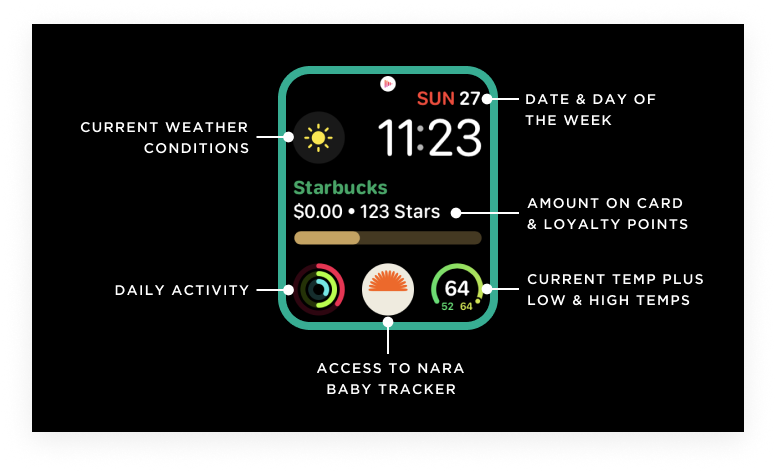
At a minimum, your complication could be a shortcut to launch the watch app, like the Nara Baby Tracker app. Or the complication can show more relevant information. For example, the Apple Fitness complication displays daily movement, exercise, and stand information on the watch’s face, while Starbucks displays loyalty and dollar amounts available on your card.

You sometimes need information delivered without relying on your phone, too. Watch notifications are perfect for such moments. While conducting customer research for the Nara Baby app, we learned that keeping a newborn on a schedule was important to parents. But because new parents were tired and busy caring for the newborn, they often missed phone notifications.
The watch app allowed us to extend the iOS app’s UX so that parents received timely notifications on their watch for scheduled activities like feeding and napping.
![]()
One of the most significant benefits of a watchOS app is that users can complete a targeted task without their iPhones. Of course, iOS apps allow users to do all sorts of things, but some behaviors naturally extend to the watch. If your app involves recording, tracking, communicating, or monitoring information, a watch app is a great way to enhance your user experience.
Quickly Recording Information
We record and save information for all sorts of reasons. And the iPhone is a great place to record data; it’s typically with us, and inputting information into apps is usually straightforward. But the downside is you have to locate your phone and manage multiple screens to record data.
WatchOS apps are great for simplifying information input. With minimal UI, your users can record information on the go. After the watch app and iPhone sync, users can add details to their earlier input.
![]()
When designing the Nara iOS app, we learned through usability research that parents struggled to record information about their babies for different reasons. For example, the baby was squirming, making it difficult to hold a phone, or it was nighttime, and they didn’t want to wake the baby with screen brightness.
Knowing this about our users, we created a simple watch UI that allows parents to record basic information and start timers. Then, when the watch and iPhone sync, they can add supplemental notes and details for other caregivers.
Actively & Passively Tracking Information
Before the widespread use of wearable technologies, people attached iPhones to their arms when jogging to track their distance and speed. With watch apps, we can leave our heavy phones behind and use the watch to track total time, distance, average pace, and calories.
And, when it syncs back with your phone, you get the aggregated data you need to understand performance. And, as a bonus, the watch can track your heart rate as you run, giving wearable tracking a one-up.
![]()
Tracking your runs is an excellent example of active tracking, but the watch can also track information passively. For health-focused apps, this is great for passing lots of data to the iOS app, which in turn provides actionable trends and insights for users.
Communicating Critical Information
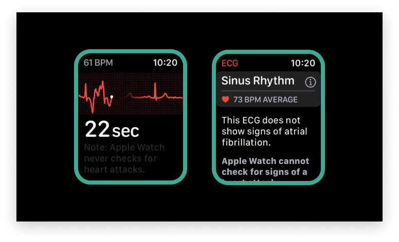
WatchOS apps can also communicate critical information when the user doesn’t have their phone handy. For example, the watch passively tracks heart rate and can determine if the user is experiencing irregular, high, and low heart rhythms.
In these situations, the user receives an alert and can contact a physician if they have been diagnosed with atrial fibrillation. Users can also record ECGs from their watch and save them to their iPhone Health app allowing physicians to review them later for irregularities.

On a less serious note, the watch is an excellent extension for communicating other types of timely information from your app. For example, the Delta app will provide timely notifications of flight gate changes, time till departure, and active loading zone.
You probably can’t easily access your phone when you are saddled with luggage and running through a busy airport. A watch notification and a wrist flip can quickly communicate important information like a gate change you might have missed with only a phone notification.
Monitoring Information
Wearable technologies like the Apple Watch allow users to monitor information easily. This improves the user experience of iOS apps because the user doesn’t have to find and pick up their iPhone multiple times.
When we designed the Nara app, we knew people wanted to quickly see how long their baby had been asleep and when they were last fed.
![]()
When users open the Nara watch app, they can see the active timer indicating how long the baby has been asleep. In addition, with a quick scroll, the user can see how long ago the baby was last fed.
These features dramatically improved the user experience of the Nara app. Parents, who are typically tired and busy, no longer have to access the Nara app on their iPhones to monitor this information.
Your user doesn’t expect to be able to do every task on their Apple Watch, so you shouldn’t be expected to design every feature, either. Plus, the reality is you actually can’t. WatchOS apps can’t support every action or feature available in an iOS app because of the watch screen’s interaction model and size limit.
Additionally, The UI for a watchOS app varies significantly from your iOS app UI. Therefore, it requires additions to your existing design system. Here are a few goals to work toward for watch app design systems that will enhance the UI.
With a watchOS app, you can utilize Apple Watch OS-specific interactions, such as the digital crown and scribble. With the crown, you can rotate through content, and scribble acts like a keyboard allowing you to compose messages. You can also use voice-activated UI to access Siri.
While there are multiple app extensions for your product team to consider, watchOS apps are some of the most widely used. As a result, they can serve as a winning strategy for creating utility and building app loyalty.
But as this article demonstrates, designing a watchOS app requires a specific skill set, and there are plenty of ways you can optimize the user experience. Partnering with digital product design experts can push you beyond your standard iOS app to a more seamless and engaging experience.
AI is transforming how we live, work, and communicate. With AI’s help, we can move from idea to product launch at super-speed. Never before have we been able to move
▪ September 26, 2025In product design, few phrases are as common, or as unhelpful, as “it needs more visual polish.” You’ve heard it in critiques, design reviews, Slack threads, and launch meetings. Everyone
▪ August 22, 2025Most progress dashboards in EdTech leave parents to interpret charts and scores on their own. Generative UI offers a more meaningful alternative by translating student data into clear, contextual narratives.
▪ July 7, 2025