Design thinking in the Age of AI
AI is transforming how we live, work, and communicate. With AI’s help, we can move from idea to product launch at super-speed. Never before have we been able to move
▪ September 26, 2025▪ April 5, 2022
We’ve all experienced the frustration of wanting to cancel a subscription only to encounter hidden buttons, illegible text, or worse, a phone number you must call to cancel. It’s a negative experience that annoys your customers and has zero upside for the business.
Seriously, no matter what you do, subscription cancellations will happen. It’s how subscription products and services work. Instead of subjecting people to a convoluted cancellation process, why not try to reverse their exit — or at least give them an easy way out?
When customers are one foot out the door, giving them a friendly cancellation flow can give them pause — or at least leave them with a positive last impression.
Even so, cancellations aren’t without value. There is so much to learn about your product when customers decide to leave. You’re missing out on opportunities to improve your product’s user experience if you’re not consistently gathering cancellation feedback.
Give your customers a sweet kiss goodbye, and learn something constructive along the way. Here’s how.
A cancel button devoid of friendly messaging and honest attempts at retention is a dull and impersonal experience. What would compel anyone to want to stay after a ho-hum send-off like that?
You still have a chance to salvage your customer’s subscription before they hit the cancel button. Start by emphasizing the benefits and perks they’ll miss out on before if they cancel. These benefits can frame the cancel button or be part of a multi-step cancel flow experience.
To remind customers what benefits they’d lose, try these different types of messages:
Show your customers the unique value their subscription provides. By clearly articulating the benefits and advantages of the membership, the business can remind the customer of the value they are receiving and its positive impact on their life. It’s why they joined in the first place and perhaps why they remained loyal.
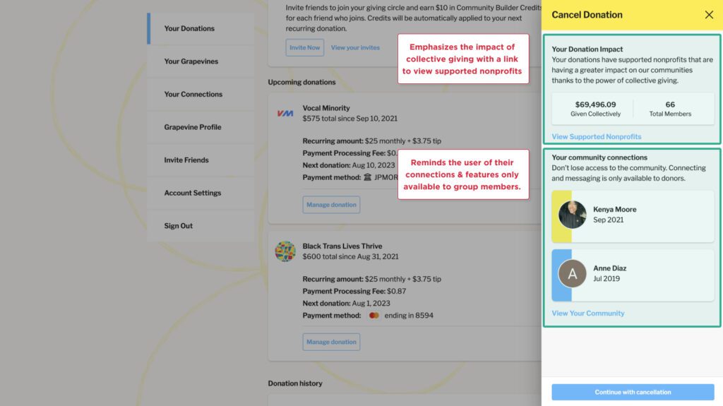
You can reinforce the value proposition through personalized communication highlighting the benefits or features most valuable to the customer. Grapevine, a digital platform focused on collective giving, shows ‘Your Donation Impact’ and a link to view the nonprofits your group has supported. Additionally, they reinforce that features associated with your community connections are only available to group members.
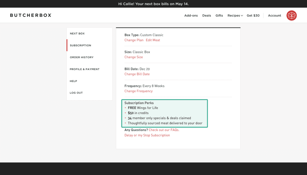
Show the customer precisely what they’ve received since they began their subscription. Along with emphasizing your product’s value, giving them a glimpse into their ‘stats’ can be a real eye-opener. The meat subscription service ButcherBox highlights the subscription perks adjacent to the cancel subscription CTA.
They remind customers of the FREE cuts received in each box, credits available for future purchases, and the number of member-only deals the member has purchased. Seeing personalized stats reinforces the value the member has received and what they will miss in the future as they consider canceling their subscription.
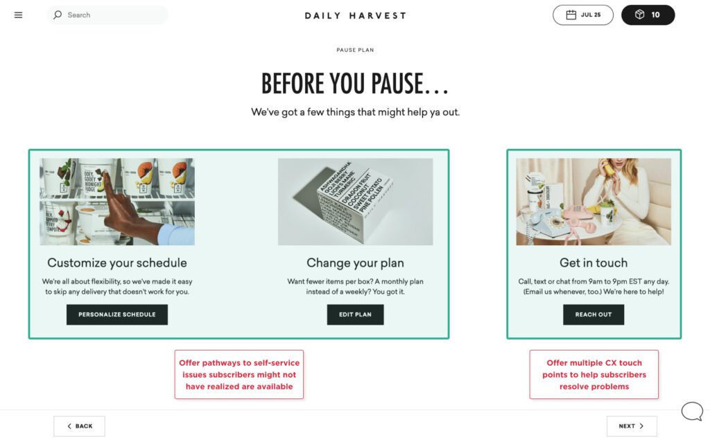
Sometimes, customers want to cancel because they don’t get your new feature or they aren’t able to self-service issues with the subscription. To clear up any confusion and save them from canceling, offer multiple pathways for the customer to change subscription settings.
As product owners, we often make assumptions about customer knowledge regarding UX and UI. However, some customers are likely unaware of their options, such as pausing their subscription, delaying a bill date, or modifying the items they receive. Also, always offer an opportunity to chat with a customer experience representative to help resolve issues the customer can’t self-service.
Daily Harvest is an excellent example of a subscription service that offers multiple pathways to self-service subscription problems. On the first step, they prompt the customer to “Customize your schedule,” “Change your plan,” and “Get in touch.”
Even with your friendly messaging, clearly articulated benefits and simple subscription management tools, cancellations will still happen. But that doesn’t mean you can’t get something out of your subscribers or give them a chance to air their frustrations. Ideally, their feedback will yield insights that help you improve your product’s user experience.
So before you show subscribers the cancel button, take advantage of the opportunity to ask them a few questions about why they want to cancel. Again, a multi-step cancel flow will be your best bet to gain insight into what’s not working and where things went wrong.
When they hit the cancel button…
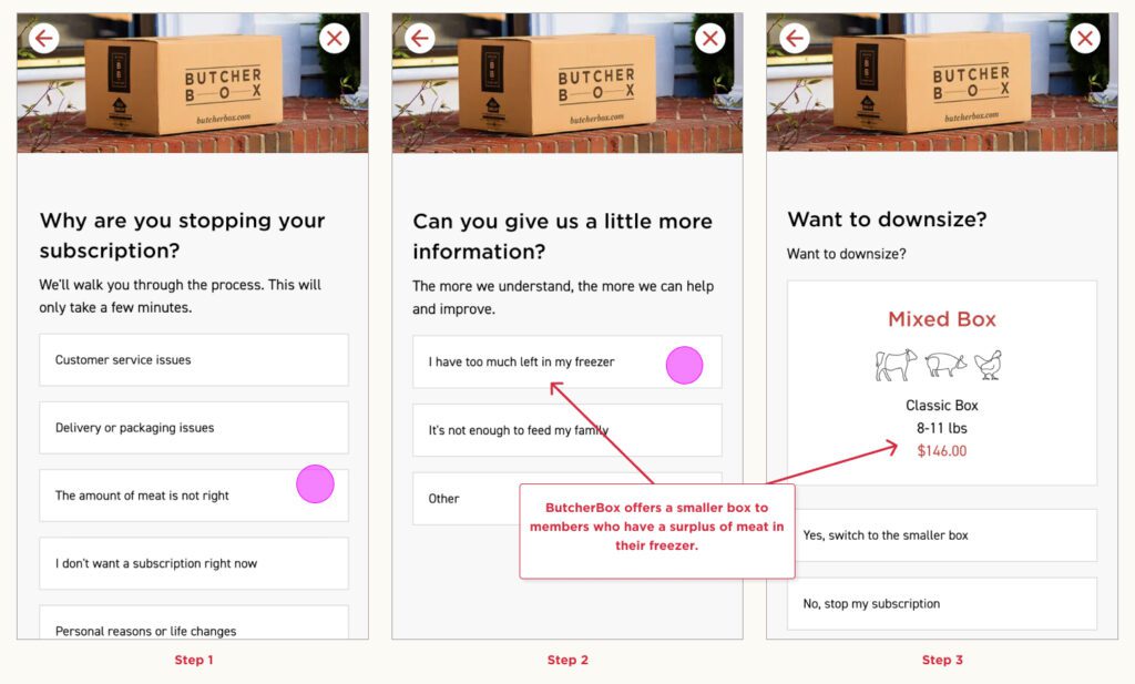
When the targeted alternative tactic didn’t work…
For example, you might learn subscribers want more flexibility with their delivery frequency and billing dates. If you know this, you can probe deeper with customer interviews or start designing new features that keep future customers from churning for the same reasons.
The peak-end rule states that people will remember and judge an experience almost entirely on how they felt at a peak, the extreme positive or negative of an experience, and the last interaction
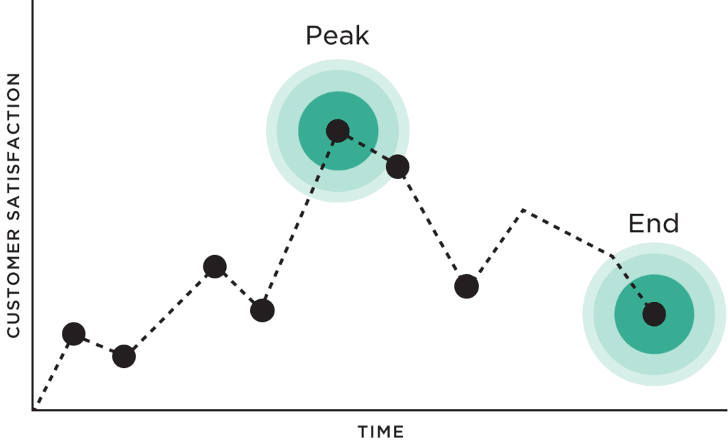
If we’re going by the peak-end rule, you’ve tried to give them multiple positive experiences to remember. So now is your final chance to leave them with a good impression.
(Who knows? They could come back!)
So don’t make it difficult for your subscribers to cancel. To make it straightforward means making the cancel button easy to find within the customer’s account. Make the process simple, and give them a positive message to remember you while you’re at it.
What you don’t want to do is make your cancellation flow so cumbersome and impersonal that it makes them feel happy that they left.
So leave them with a kiss goodbye — give them an easy way out. You’ve done what you could. And with an empathetic cancellation flow, you’ll hold up a better overall impression of your brand.
Don’t let cancellations get you down. Instead, view them as an opportunity to bring subscribers back from the brink — and learn how to give your existing and future customers a better experience while you’re at it.
Everyday Industries is a UX strategy and digital product design firm with expertise in consumer and retail tech. Learn how our UX and digital product design services can help you design subscription experiences that drive business growth.
AI is transforming how we live, work, and communicate. With AI’s help, we can move from idea to product launch at super-speed. Never before have we been able to move
▪ September 26, 2025In product design, few phrases are as common, or as unhelpful, as “it needs more visual polish.” You’ve heard it in critiques, design reviews, Slack threads, and launch meetings. Everyone
▪ August 22, 2025Most progress dashboards in EdTech leave parents to interpret charts and scores on their own. Generative UI offers a more meaningful alternative by translating student data into clear, contextual narratives.
▪ July 7, 2025