4 Tips for a Data Visualization UX to Increase User Engagement
Conversion By Thomas DiNatale ▪ November 4, 2022
Motivating users towards healthier lifestyles—that’s the real power of well-designed data visualizations in health and wellness tracking products. People gain insight that guides their next step forward when personal metrics are presented clearly through thoughtful visuals and user-friendly interfaces. They feel empowered to make changes.
Without those intuitive and encouraging data insights, though, users can feel confused. Unable to accurately interpret their health patterns, eating habits, or biometric data over time, people lose touch with the product and disengage with the experience. Unclear data feels meaningless, failing to motivate progress.
Furthermore, poor data visualization can significantly affect key business metrics, reflected in slipping user engagement, higher subscriber churn, negative reviews, and stalled adoption rates. But when designers get data visualization right, these products have immense potential to positively impact lives by revealing personalized insights that drive lifestyle improvements.
The key is to visualize complex personal metrics in ways that enlighten and inspire users while avoiding information overload. We’ll explore common data visualization pitfalls to avoid and the 4 UX tips to help you create habit-forming, user-centric data visuals that turn health information into meaningful motivation.
Common Data Visualization Pitfalls to Avoid
One benefit of health and wellness tracking products is helping users interpret personal metrics through intuitive data visuals. If poorly designed, though, those same graphs, charts, and dynamic dashboards meant to provide clarity can instead perplex, discourage, and distance users from a deeper understanding of their lifestyle patterns.
Rather than motivating positive change, confusing data visualization will drive disengagement.
So, what’s behind subpar data visualization experiences that fail to inform or captivate? By sidestepping just a few common design pitfalls, you can transform tangled information into compelling graphics that speak to users. Here are 4 of the most frequent—but fixable—data visualization mistakes:
1. Hard to Read Fonts & Confusing Typographic Hierarchies
Squinting and peering shouldn’t describe how users view their data. But confusing, distorted, or just plain tiny fonts can make deciphering a chart or graph a headache-inducing chore.
Product designers walk a tricky tightrope between designing aesthetically pleasing data visualizations and functional interfaces that communicate information. In the design process, it’s common to try the following, all of which can overwhelm the visualization:
- lighter weights
- stylized fonts
- compressed widths
- type set at an angle
- undersized headings
While typographic tension and hierarchy can help guide the data story, poor legibility obscures it. Hard-to-read fonts and complicated design lockups can quite literally encode critical health insights, leaving users stranded without clear takeaways.
Typography should describe and add to the data you are displaying to the user. It shouldn’t take center stage.
2. Color Contrast & Accessibility Failures
At first glance, color choices may seem like minor design decisions when visualizing data. But the right colors can focus user attention on critical insights, while the wrong colors can distort data and cause confusion.
Extreme high contrast between colors competes for user attention rather than guides it. For example, data visualization color palettes derived from opposing brand hues will create too much contrast. Data gets lost in straining color comparisons rather than revealed through thoughtful coordination.
Overly ambitious thematic colors also backfire even with the best intentions. For example, in a sleep tracker, it might seem intuitive to map bright colors to daytime activity and dark hues to nighttime activity. However, contrast between dark and bright palettes can make extracting trends difficult despite matching mental models users hold.
So, how should designers approach color in data visualization?
First, favor adjacent colors on color wheels to ensure sufficient differentiation without excessive contrast. Second, test speculative themes with users to check if intuitive color mappings aid or obscure comprehension. Finally, remember that while brand consistency matters, data clarity and accessibility matter more in data visualization color choice.
3. Misplaced or Confusing Data Labels
At first glance, the position of data labels and legends can seem like a trivial formatting choice. But seemingly minor placement decisions can cause UX friction. We call it death by a thousand paper cuts: the slight friction moments that add up to have a more considerable negative impact on your user experience.
When labels and legends are far from the primary charts they annotate, divided attention will impact a user’s ability to interpret data. The back-and-forth scanning between a visualization and the legend introduces pointless yet considerable friction.
So, what’s the solution for designers? First, cleanly incorporate descriptive data labels directly onto charted lines and bars rather than placing them in outlying areas of the UI. Second, position supporting legends and reference information immediately adjacent to graphs. The legend shouldn’t exist in another part of the UI or require progressive disclosure to access.
4. Complexity from Excessive Legends and Poor Chart Choices
Brands will sometimes choose a chart with high visual impact, even though the data isn’t necessarily best represented by that chart. Likewise, we often see brands choose a beautiful, highly interactive chart that may seem impressive at first, but it doesn’t end up being valuable to the end-user experience. Bar charts might seem boring or not as fancy from a product design perspective. But depending on your user and the information they are trying to retrieve from your visualization, it may be the best way to showcase their data.
Now that we have the common mistakes taken care of let’s look a few ways to really turn up the power of your visualizations. Turning user data into compelling visualizations may sound complicated. But it doesn’t have to be. Fortunately, there are many simple ways to turn your users’ data into inviting visualizations that keep them engaged and focused on the underlying data.
Be Bold and Rely on Simplicity
Users can struggle to interpret — and therefore learn from — complex data visualizations. Simplifying the visualizations improves the user experience by:
- Reducing the cognitive load required to analyze and retrieve important information
- Limiting potential confusion and misunderstanding of the aggregated data
A simple technique is to use visualization patterns people recognize and feel comfortable reading—for example, line charts, horizontal and vertical bars, segmented bars, and pie charts. Another UI technique you can lean on is progressive disclosure. Rather than show everything immediately, allow the user to step into complexity. Give them high-level insights about their data, and then let them decide if they want to dive deeper.
Always Make Use of Usability Testing
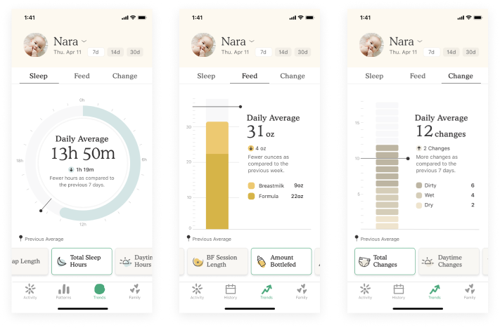
Moderated usability testing is an excellent way to get feedback from users about their experience with your app and how they interpret and use visualizations. For example, when we designed the Nara Baby app, we ran usability testing on the first release of trends and discovered that users found the visualizations confusing. For example, they didn’t understand how the circular time-based visualization related to their data. Additionally, they struggled to understand the vertical bars used to visualize counts and percentages.
We learned users preferred more straightforward and familiar visualizations, allowing them to interpret their baby’s trends without guesswork while also easily accessing the data supporting the trend. Armed with this insight, we redesigned all the trend visualizations and introduced a simplified version that utilized vertical bar charts. Based on inbound customer feedback, users found the visualizations easier to interpret and were more engaged.
Provide Options for Visualizing the Data
Users can struggle to make sense of their aggregated data if you provide only one data visualization. Creating multiple ways to interact with and visualize data can improve the overall user experience by allowing people to interpret information in the way that best suits them.
For example, you can provide users with filters and multiple chart options that allow them to personalize their data visualization experience. Providing options will enable users to interpret the underlying data in ways that matter to them.
If you need help determining what options to provide your users, and customer research isn’t an option, App Store reviews can be a starting point. For example, this Snoo app review includes suggestions for visualizations that would make the app more relevant to this user:
“I want the Daily Log to be a table of four columns with Sleep Start Time, Sleep End Time, Total Duration, and Percentage Of Time Soothing. No visual, just a text log. The horseshoe graphic makes little visual sense, and the exact times are not displayed.”
At a glance, you can imagine why this semicircle of data doesn’t work for this user. And their review highlights the importance of allowing users to view data in ways that work for them. In this case, a simple segmented control separating the visualization and table-based data would solve this need. For every Snoo Baby app user that loves the ‘horseshoe graphic,’ another craves a different way to understand their baby’s sleep patterns.
Highlight Key Information & Trends
Users sometimes need to learn how to interpret data visualizations or assess trends. Highlighting essential information allows users to retrieve important information at a glance and quickly identify patterns in their data.
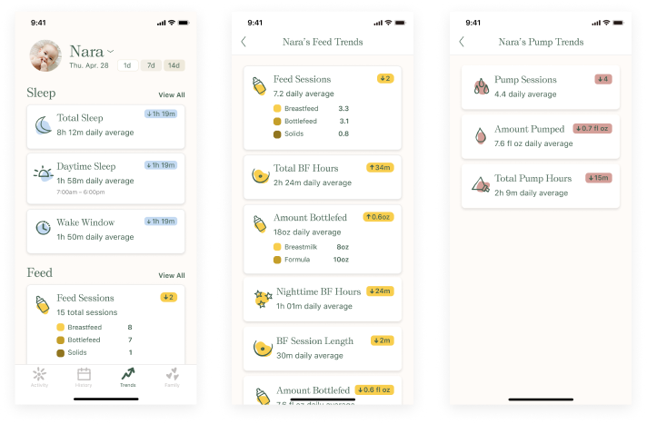
An overview screen is a helpful tool that facilitates this kind of rapid insight. In testing with Nara, for example, we learned users wanted an at-a-glance understanding of how the baby’s activities changed weekly. Unfortunately, the UI in the first release required a lot of scrolling and tapping, preventing users from quickly accessing the most important trends.
Knowing the visualization detail was secondary to understanding the trend insight, we created a paginated experience with an overview page. The page consists of cards that provide the user with the trend average or counts over the selected timeframe: daily, weekly, or 14-day. The user can also easily understand how the averages and counts are trending up or down relative to the previous timeframe.
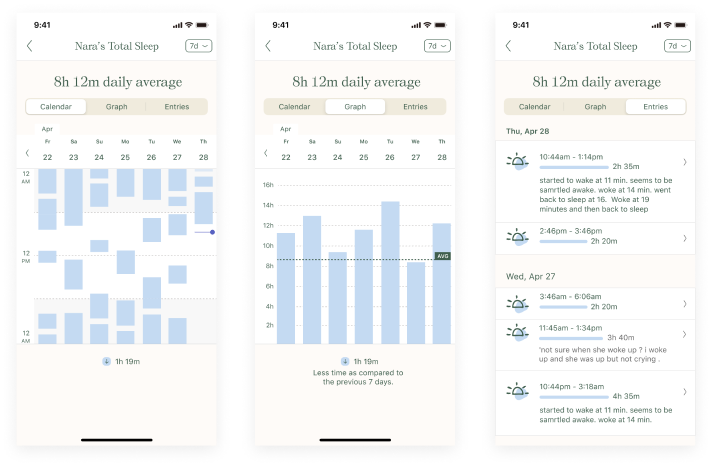
The user can tap the top-level trend cards to gather more detail. For example, suppose the user taps on total sleep. In that scenario, they will immediately see in large type at the top of the page the trend for the selected timeframe. Below the trend insight is a graphical view, a calendar view, and the entries supporting the insight. The user can also change the timeframe in this view and edit any errant data on the entries tab.
Partnering With a Digital Product Design Team
With the right partnership, you can build a digital health or wellness product that’s both customer-driven and visually appealing.
Our team covers all your bases when designing digital products that are invaluable to your customer. To us, customer insights are foundational to product design. With the right design strategy, users feel at ease and confident that they can rely on your product again and again to meet their needs.
We want to help you create an exceptional experience. Consider adding us to your team.