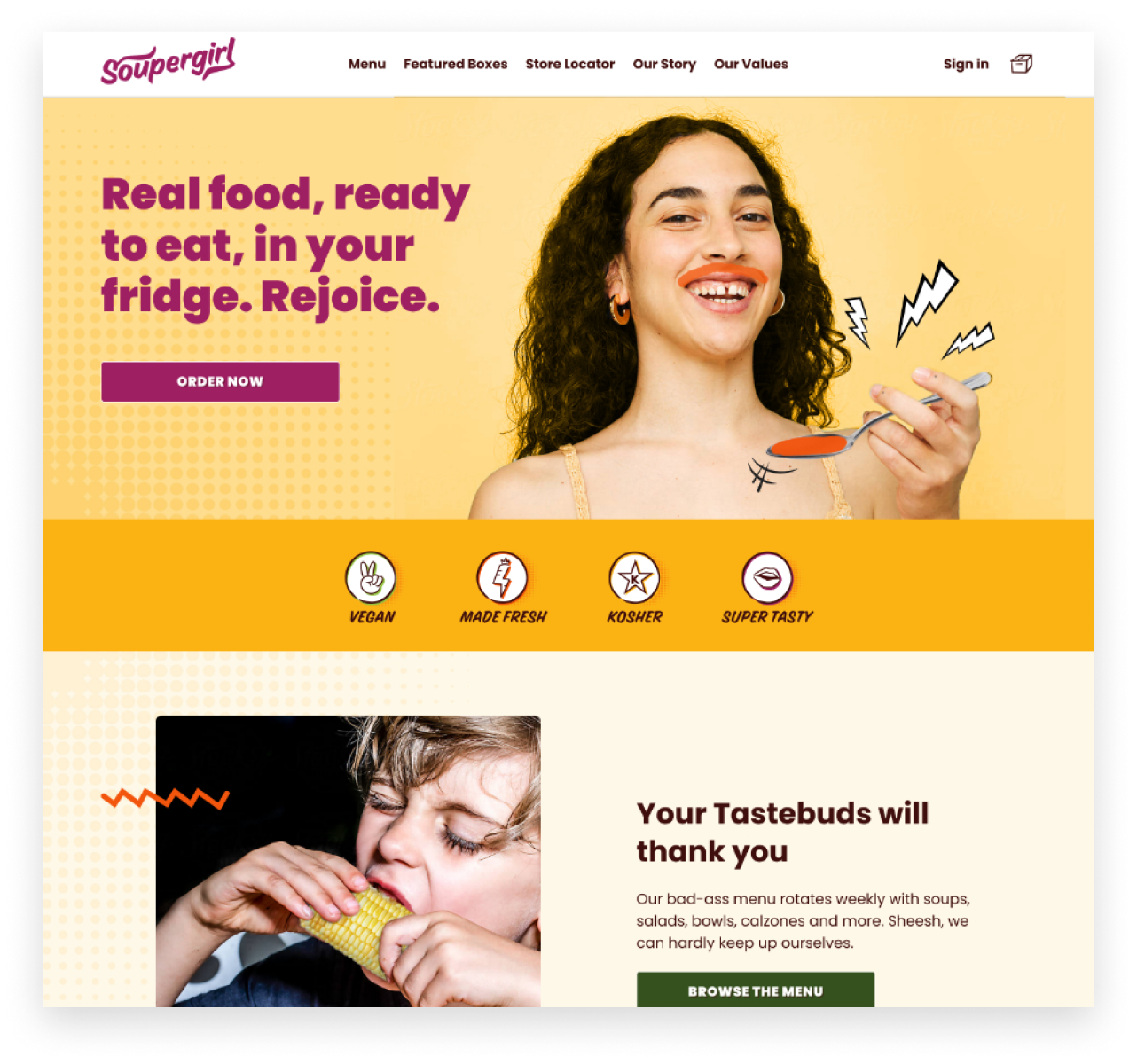
Soupergirl is a mission-based business that creates healthy, delicious, responsibly sourced vegan meals and delivers them fresh to your home. Based out of D.C., they started with soup and quickly grew their menu and reach. Their next stop was expanding their menu and delivery with a new subscription offering. Their existing site needed a rehaul; it wasn’t optimized for subscription, didn’t explain their mission, and didn’t capture their brand’s fun, energetic personality. We worked with the Soupergirl team to redesign their site from the shopping to the account management experience.


We started by interviewing Soupergirl’s existing customers. We wanted to understand the unique aspects of Soupergirl and what they valued about the brand. Customers shared what they loved about the meals, how Soupergirl fit into their meal routines, and their overall experience with the site.
These loyal customers expressed genuine enthusiasm for the healthy and convenient meals that Soupergirl provided. As well as the values and missions- woman-owned, sustainable sourcing, giving back to the community – the list went on.
We learned customers preferred to place weekly orders because the site experience made it challenging to manage their subscriptions.
We learned customers preferred to place weekly orders because the site experience made it challenging to manage their subscriptions.
However, their site experience was a different story.
Customers found it difficult to find the flavors they preferred or met their dietary needs using the site. In addition, while they loved the freshly rotating menu, they found managing their subscriptions challenging. As a result, many opted to place weekly orders instead of dealing with a subscription.
The research made it clear that the website did not match customers’ experience with the service and the brand they loved. The customer insights gave us a solid foundation to improve the Soupergirl customer experience.
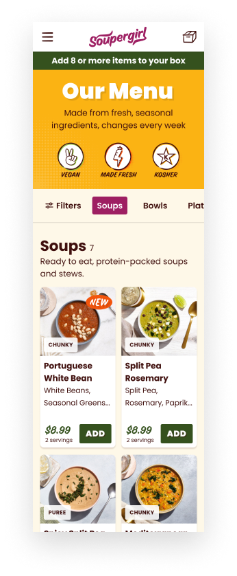
The Soupergirl menu changes weekly, so we used it as the center point of the shopping experience. From the menu, shoppers can build their set of weekly meals.
In usability testing, we learned shoppers relied heavily on the imagery to pick their meals. As a result, we prioritized large photographs on the menu and detail pages to provide visual clues to servings, texture, and flavors.
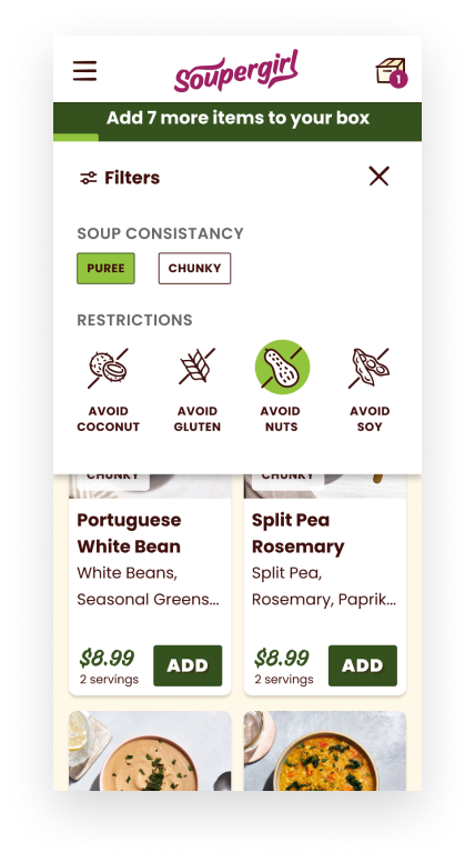
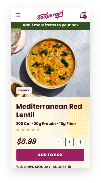
Filters and visible tags call out ingredients (contains soy) and taste preferences (pureed soup). These details help shoppers narrow the menu to foods that appeal to them. The detail screens were enhanced with information on storing, preparing, and recycling to answer common customer questions.
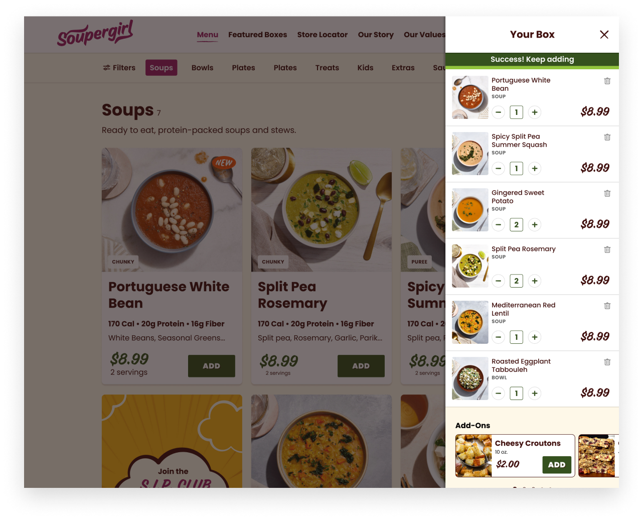
In the words of the CEO and founder, Sara, The Soupergirl site needed to be “bold, fun, and deliciously ethical.”
To meet this vision, we worked with the team to weave the brand’s benefits: freshness, convenience, and giving back – throughout the shopping experience with custom illustrations. We upgraded their bold color palette to meet accessibility standards and created custom graphics that add to their superhero theme.
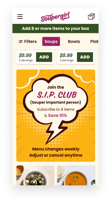
Like many brands, subscription is a critical aspect of Soupergirl’s business model. Customers can choose between 1-time purchases or joining the Soupergirl subscription club, SIP (Souper important person).
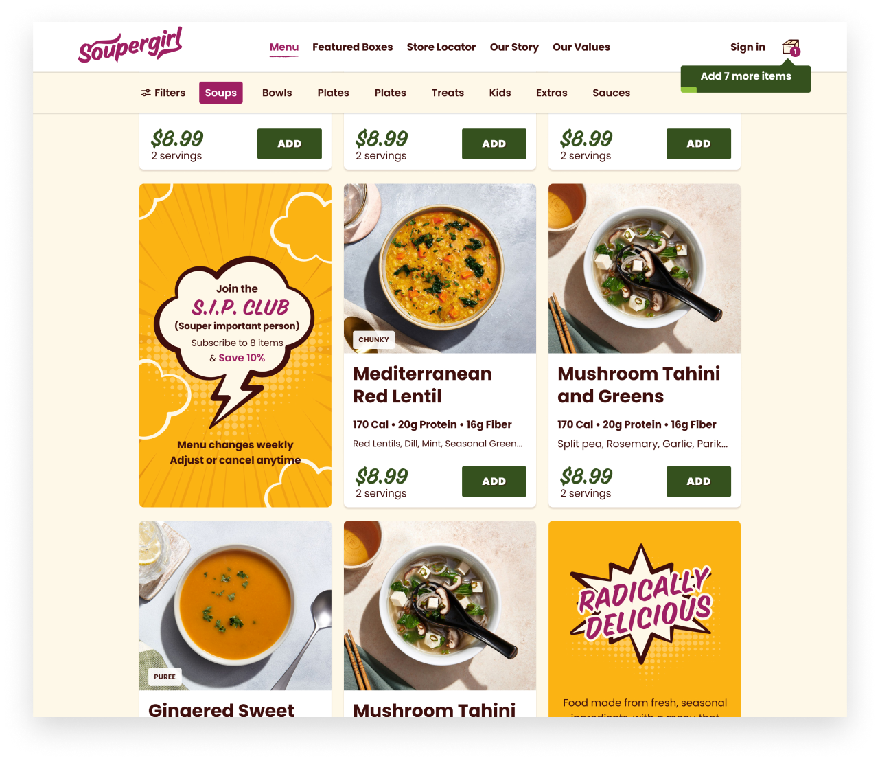
To help explain the subscription benefits, we introduced the SIP club early in the flow on the menu and detail screens. When customers reach checkout, they are familiar with the subscription benefits. We added FAQs to answer questions about the program and reinforce the value and flexibility of being a subscriber.
The subscriber account user experience was designed with a focus on subscription account management best practices. Customers can easily swap meals, track orders, and manage their account. Subscription options like pausing and skipping are clear and easy to find. And the favorites feature gives customers a fast way to favorite meals when they are available on the rotating menu.
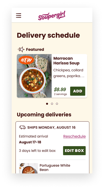
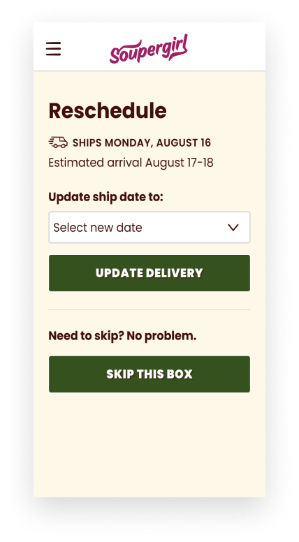
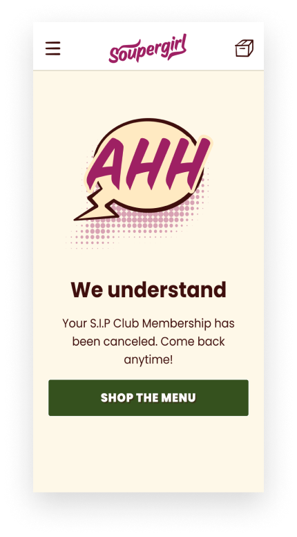
The new site captures the bold personality that makes Soupergirl unique and creates a clear path for shopping and subscribing. By redesigning the site and customizing the checkout and account experiences, Soupergirl can offer its delicious menu to more happy bellies. The redesign results have had a powerful impact on the business, increasing the average order value by 31% and reducing the bounce rate by 37%.
Sara PolonThe Everyday team brought a fresh, welcome, and expert perspective to the redesign process. They enabled us to completely reframe our approach to our website. The result is an easy-to-use, simple, eye-catching experience that enables users to seamlessly subscribe to our service. We couldn’t be happier!”
We work as an extension of your team, bringing UX thinking, rapid prototyping, and iterative design from early research all the way to development-ready designs.
We help you understand why users are struggling, dropping off, or not converting. Through UX audits and usability testing, we design experiences that move the metrics that matter.
We help teams design AI-powered products that users actually trust. From interaction design to prompt UX, we make complex, variable AI behavior feel intuitive and human.