Design thinking in the Age of AI
AI is transforming how we live, work, and communicate. With AI’s help, we can move from idea to product launch at super-speed. Never before have we been able to move
▪ September 26, 2025▪ June 21, 2022
Confusing management experiences are all too familiar with subscription services. Chalk it up to easy-to-implement eCommerce platform plugins, engineering limitations, or juggling too many business priorities. It happens.
Whatever the stumbling block, beware. If you ignore a poor subscription management experience for too long, you could see frustrated customers who prefer to cancel than spend extra time managing their next shipment. Hello, poor retention metrics and a customer lifetime value needing resuscitation.
Luckily, there are plenty of ways to ensure your customer’s management experience is simple and seamless.
It sounds obvious, but it’s often overlooked as a source of friction. Subscription management is inherently different than managing one-off purchases from eCommerce sites. Customers frequently need to revisit their accounts to manage items in their next order, understand the total cost, and change bill dates or shipping frequencies to accommodate their lifestyle.
Simply put: There’s a lot more for them to do. And it’s your job to ensure it’s easy for them to do it. What is your top priority? Provide customers with a straightforward path to access and manage their next order. These details should be the first thing they see when they open their account.
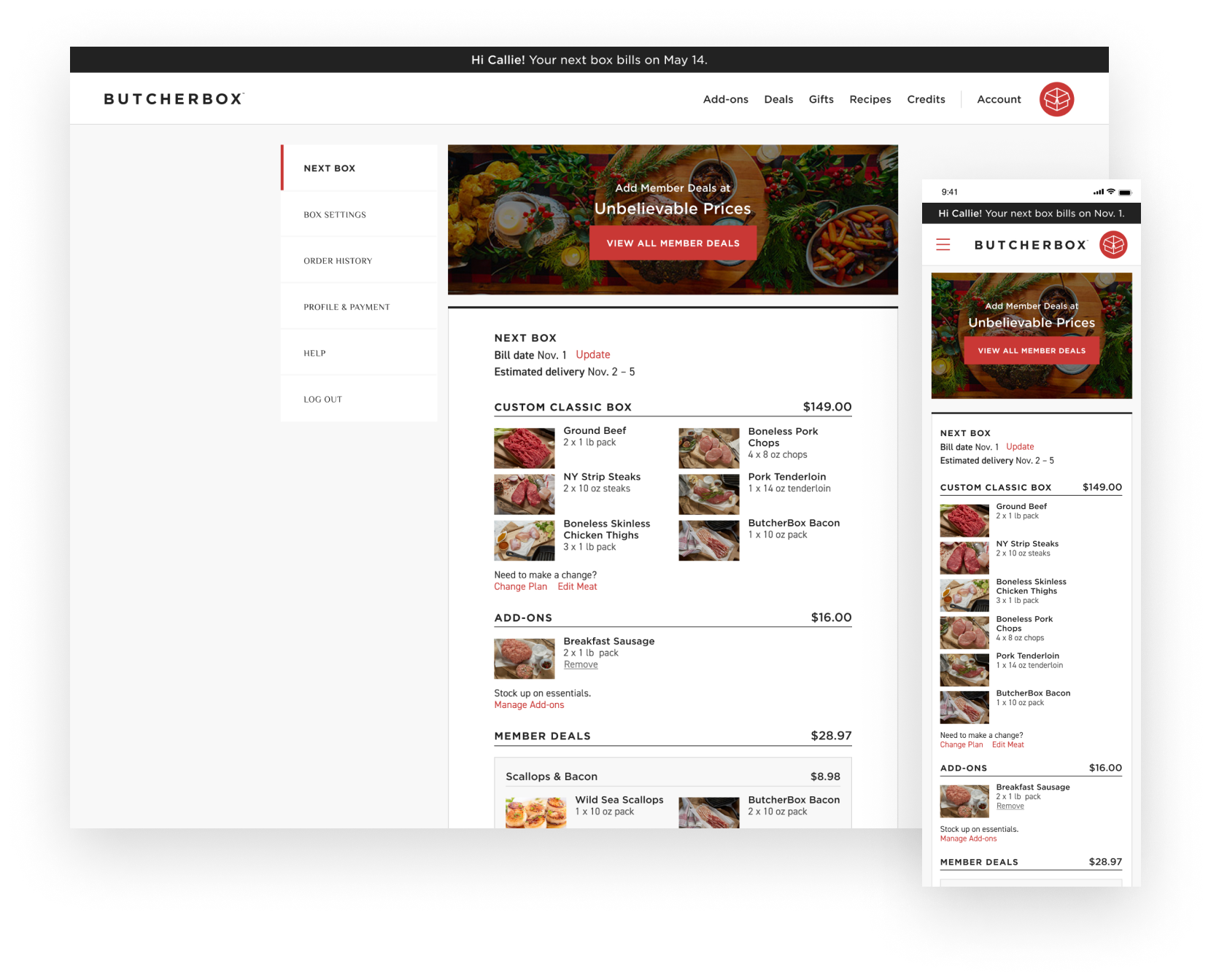
For example, when we redesigned the ButcherBox subscription management experience, we created a page dedicated to the subscriber’s upcoming order. From this page, they can edit every aspect of their box, including bill date, plan type, and items.

To make this happen, create a primary navigation element solely dedicated to the upcoming order (like the ButcherBox example, Next Box). All past orders live in an order history; the upcoming order has a unique URL. The customer’s ‘Next Box’ is an easy-to-scan overview of all the critical information they need to feel confident about their upcoming order, including the total cost, items in the order, ship date, and estimated delivery date.
In addition to clearly articulating the details about the upcoming order, provide easy-to-access CTAs to allow the customer to make changes. If they’re going out of town or want to add a new item they’re interested in, they’ll have an easier time completing their task.
The easier it is for your customer to navigate their ‘Next Box’ information, the less likely they will sound the alarm and contact customer service to complete a task.
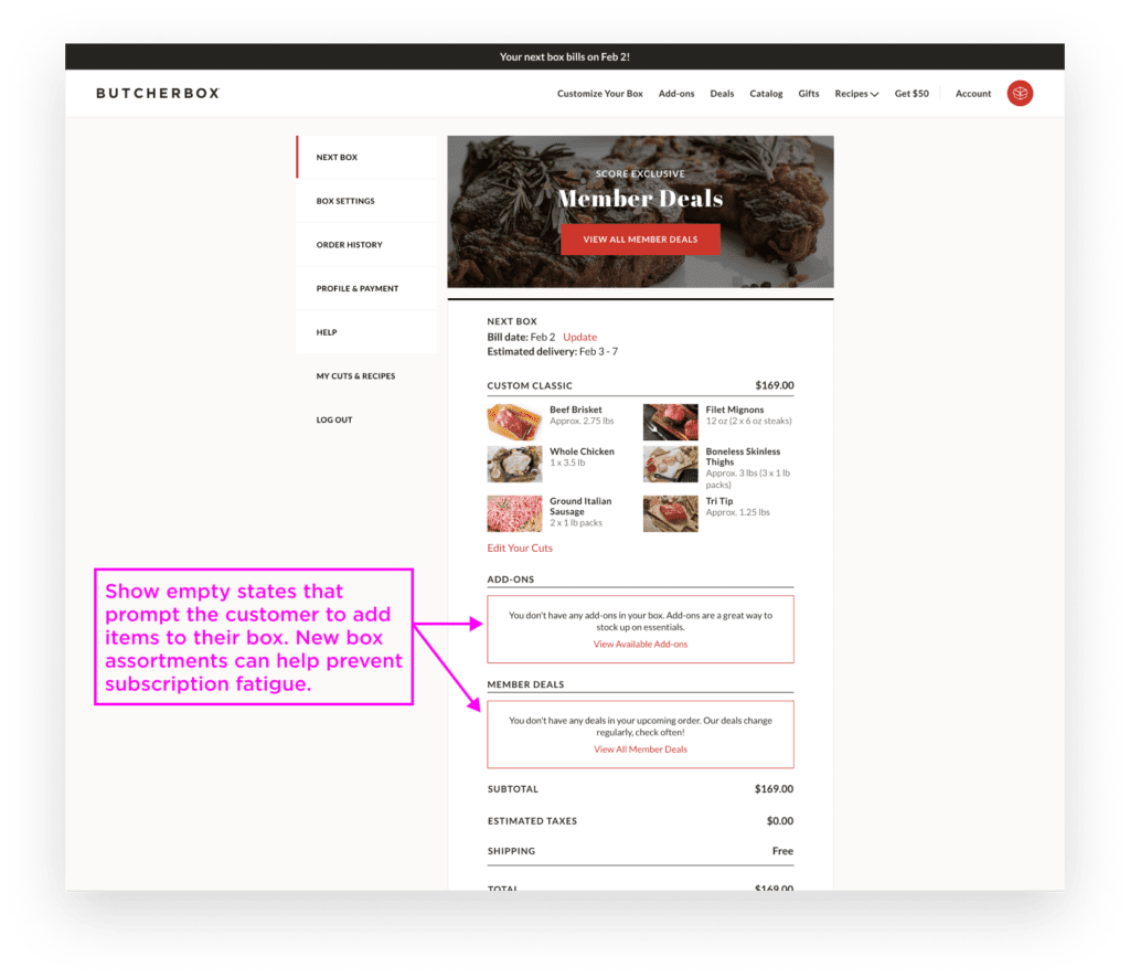
You’ve made it easy to access the upcoming order. Now, you need to make it easy to change the contents of their order. Many services only show you what is shipping in your next box, but you can go further. Give your subscribers the opportunity to customize their upcoming orders with clear CTAs to add or remove items.
An easy change process allows them to tailor their subscription box to their needs, allowing them to control their experience and feel confident that what they are receiving is something they need.

A simple place to start is empty state messaging within the upcoming order. Consider this an opportunity to upsell products or provide personalized product ideas. Even a simple CTA that says “Discover new items to try” with recommendations based on past purchases or best sellers can hint to customers that there are available options they may not have considered.
Or, consider prompting returning subscribers to try something new by highlighting featured or seasonal products when they log in. You can say, “As someone who bought X before, we think you’ll love Y!”
They say variety is the spice of life. As it turns out, offering recommendations showcases the breadth of your inventory so subscribers don’t miss out. Most importantly, it reduces decision fatigue. By thoughtfully suggesting products, you guide them to fulfilling options without the effort of exploring everything available.
Your customers signed up for your subscription because they were looking to solve a problem, and your product fits the bill. Use this to your advantage by showing them the value they’ve received since becoming a member. Doing so reinforces why they signed up for your subscription in the first place.
Understanding how the subscription is part of the customer’s life over time is critical here. You can’t just highlight any statistic like how many products they’ve purchased or boxes they’ve received; it should mean something to them.
Knowing your customer’s values and motivations for using your subscription is invaluable because you can tailor the metrics to what matters to them. If you aren’t sure what motivates your customer to buy, consider running a research study to learn how your subscription product solves customer problems.
For example, say you’re a subscription service that delivers healthy vegetarian meals for customers to cook. And from your research, you’ve learned there are three primary reasons people sign up for the service.
Climate-conscious buyers: You could show how much carbon is saved by choosing vegetarian meals over meat or fish.
Health-conscious buyers: You could show the pounds of nutritious vegetables, fruits, grains, and legumes they’ve received.
Price-conscious buyers: You could show the estimated money saved by not eating out or eating meat and fish.
Highlighting each customer’s personalized value is like a pat on the back whenever they open their account. Not to mention, it’s an excellent tactic to make a customer think twice before hitting the cancel button.
Managing a subscription doesn’t have to be boring. Go the extra mile by providing a unique but helpful feature that will excite your customers.
Of course, this can’t be any feature, though. It must be relevant to how your subscription fits your customer’s lifestyle. Again, it’s important to lean into customer research here to understand current behavior and how your product can further support or improve these behaviors.
For example, when we designed the Blue Apron app, in our research phase we noticed people were saving the physical recipe cards to use in the future. After receiving several shipments, however, the recipe cards became too cumbersome to keep and sort through. The cards were stuffed in cabinets, and it took too long to find the right card when they were ready to shop for ingredients and cook. As a result, the cards just gathered dust.
But, knowing this from our research, we designed a virtual recipe box within the app that allowed customers to keep the recipes they liked in their account and toss the ones they didn’t. It was simple to sort and search and easily accessible on their phones the next time they were at the grocery store and needed to look up ingredients for a recipe they wanted to cook a recipe.
Customer needs change over time. Giving subscribers multiple ways to manage their orders, both what they receive and when allows them to adapt the service as their lifestyle evolves.
Support Different Shopping Behaviors
Allowing your UI to accommodate different shopping behaviors is an excellent starting place. For example, do your customers like browsing and saving items before making a purchase decision? Or do they shop with a laser focus, preferring shortcuts for adding items?
If those are your primary shopping behaviors, your UI should support both behaviors. Doing so accommodates customer preference and, as a result, improves their subscription management experience. Trying to force every buyer into the same shopping mode will create friction and send customers searching for the cancel CTA.
Provide Flexible Shipping Options
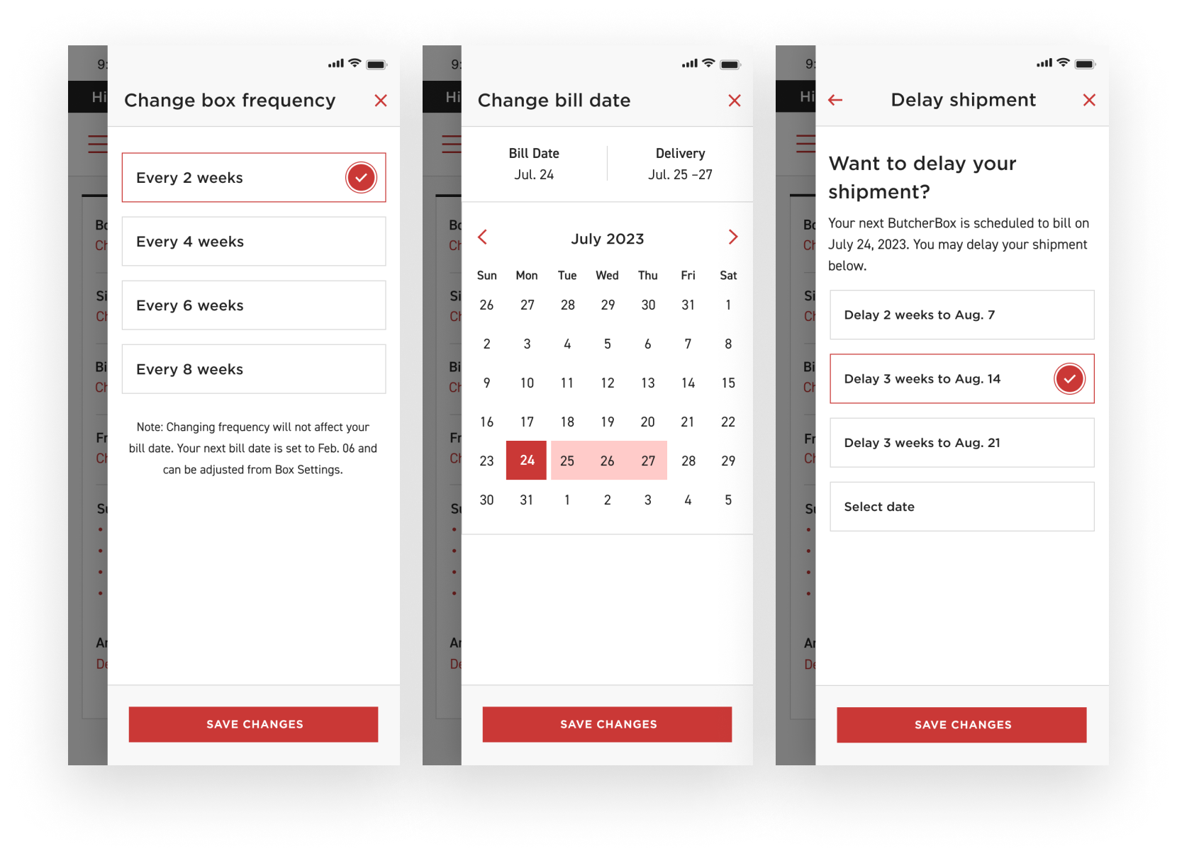
Another way to accommodate changing customer needs is to provide flexible shipping options. Customers have countless lifestyle reasons to manage their shipments. From vacations to upcoming holidays with family in town, providing multiple pathways to manage shipping cadence is essential. Offer customers better control over deliveries by letting them:

The ButcherBox subscription management experience provides multiple ways to manage upcoming shipments. For example, customers can change their frequency and bill date and are prompted to consider delaying their next box in the cancellation flow. You do not need to overwhelm customers with endless customization options.
Too many choices will complicate the experience instead of simplifying it. Start by using customer research to identify the most common subscription management tasks people want to complete. Then, design intuitive pathways to accommodate just those essential tasks. Focusing on streamlining the most frequent actions leads to the best experience overall.
Regularly reviewing your site experience with real customers lets you keep pace with changing user needs, ensuring their entire experience is rock solid.
As the subscription model continues gaining popularity across various industries, focusing intently on your customer’s end-to-end experience is the key to standing out. By implementing and evolving these five enhancements to simplify your subscribers’ management experience, you empower them to get the most from your service.
Making it effortless for customers to monitor upcoming orders, customize subscriptions, track value, adapt to lifestyle changes, and access unique features can cement their loyalty. Building convenience into every touchpoint results in subscribers enthusiastically promoting their positive experience rather than canceling their accounts.
Use these tips as fuel to transform account management from a routine obligation into a delightful advantage that your customers can’t live without.
AI is transforming how we live, work, and communicate. With AI’s help, we can move from idea to product launch at super-speed. Never before have we been able to move
▪ September 26, 2025In product design, few phrases are as common, or as unhelpful, as “it needs more visual polish.” You’ve heard it in critiques, design reviews, Slack threads, and launch meetings. Everyone
▪ August 22, 2025Most progress dashboards in EdTech leave parents to interpret charts and scores on their own. Generative UI offers a more meaningful alternative by translating student data into clear, contextual narratives.
▪ July 7, 2025