4 Tips to Successfully Shape New Product Features with Cross-Functional Teams
Design Process By Helen King & Thomas DiNatale ▪ May 12, 2023
Exploring a new feature opportunity for your product can be murky waters to navigate with a cross-functional team.
The benefit of working with a cross-functional team is the potential for the outcome to reflect various aspects of the business, product, and customers. The challenge is corralling these perspectives, gathering alignment, and collectively shaping a yet-to-be-defined feature.
Without a defined process, teams can lose time churning on concept after concept or push forward with a feature that feels disconnected from the broader customer experience. So, how do you guide your team from general goals and various ideas to a final user experience that everyone feels confident will improve the product?
We recently worked with a client to shape a new product feature and used four tactics to steer the process.
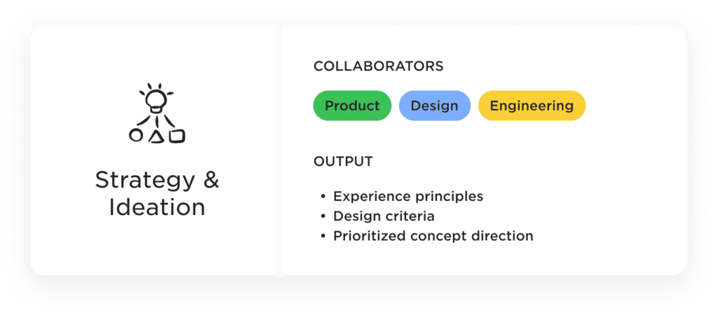
1. Kickstart the Process with Collaborative Strategy Sessions
Our client in the direct-to-consumer (DTC) food subscription space wanted to improve their customer’s experience after checkout—the existing order confirmation UI was underwhelming and didn’t build excitement or momentum with new customers. Additionally, the team understood that these early touch points could significantly impact the customers’ overall experience and improve critical metrics like lifetime value (LTV) and customer satisfaction scores.
Before jumping in and sketching solutions, we needed to lay the foundation for a design concept. So, first, we established the parameters, agreeing the design concept had to align with customer needs and the existing touch points they experience before and after checkout. Then, using this as a jumping off point, we led two collaborative sessions to align the team on a concept direction.
Session 1: Guidelines & Guardrails
Using past qualitative customer research, quantitative usage data, and a landscape audit of personalization experiences, we explored the following questions through activities with the team in a “Guidelines & Guardrails” session:
- What could benefit customers most at this stage of their experience?
- How are they engaging post-checkout now?
- What forms of personalization could be helpful to them?
- How would the concept fit into the bigger picture of service touch points?
The output of the first session was a set of experience principles and design criteria to help direct the design concepts and serve as an ongoing point of reference in the design process.
Session 2: Concept Ideation
With shared clarity on the parameters and goals of the experience, we ran a structured ideation session to brainstorm different ways we could add value to the post-checkout experience.
The team generated four distinct concept directions. We then reviewed each concept based on how it aligned with the experience principles, design criteria, and technical feasibility.
Based on the review, we ended the session with a prioritized concept direction for product design.
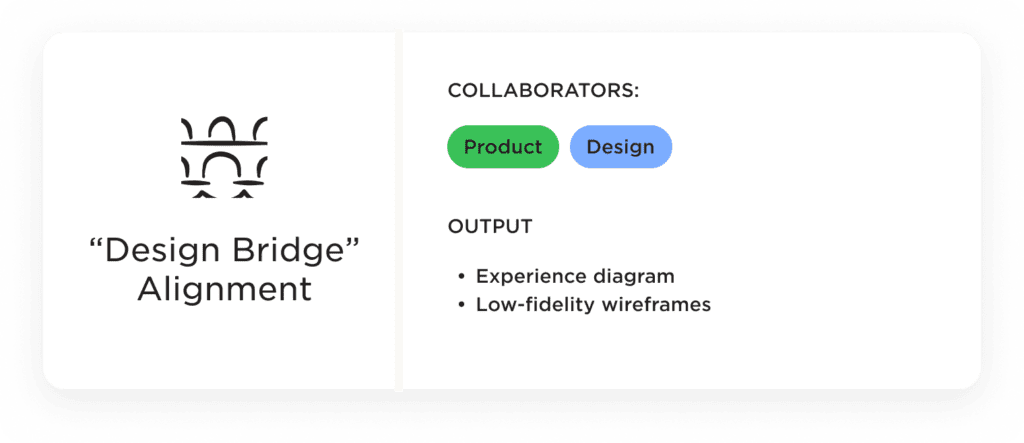
2. Build in Necessary “Design Bridge” Moments with Your Team
Having built team alignment around a concept direction, the details of the experience still needed to be defined. Rather than jump into UI, we decided to kick off the design with an experience diagram. Doing so allowed us to map out the touch points, interactions, and transitions in a clear and organized manner before considering the UI. It also served as a tool for the team to decide how we could fill in UX gaps.
Experience diagramming
The diagram mapped out the flow of the new experience and modeled how the feature could be structured. The critical components of the diagram included:
- UX goal of the new product feature
- Information we know about the customer from onboarding
- Additional inputs required from the customer
- Potential outputs
The diagram’s low fidelity allowed us to talk about what shape the feature could take without getting into the weeds of the user experience or interface.
While this wasn’t a planned step, the experience diagram helped bridge the strategy sessions and the start of low-fidelity wireframing. It also ensured the design didn’t take the concept in a direction without input from the team.
Low-fidelity wireframing
Once we agreed on the potential inputs and outputs of the experience, we started to create low-fidelity wireframes. Moving from an experience diagram to low-fidelity wireframes versus high-fidelity screen design provides several benefits:
- Quick Iteration: You can quickly share and iterate on multiple UI ideas, enabling a faster design cycle.
- Focus on Structure & Functionality: You can emphasize the overall structure, layout, and functionality of the experience, allowing the team to discuss user flows, content hierarchy, and interaction patterns rather than details.
- Reduced Visual Distractions: You can keep team members focused on discussing core aspects of the user experience rather than getting distracted by colors, type hierarchies, iconography, and photographic assets.
Quickly iterating with low-fidelity wireframes allowed us to validate concepts, gather team feedback, and refine the overall user flow before we invested significant time in high-fidelity screen design.
High-fidelity screen design
With team buy-in on the user flows, we incorporated brand typography, color, icons, and photos into the UI to prep for usability testing. Having participants interact with high-fidelity mockups reinforces brand recognition and allows for feedback on specific elements, including visual hierarchies that aren’t necessarily present in low-fidelity wireframes.
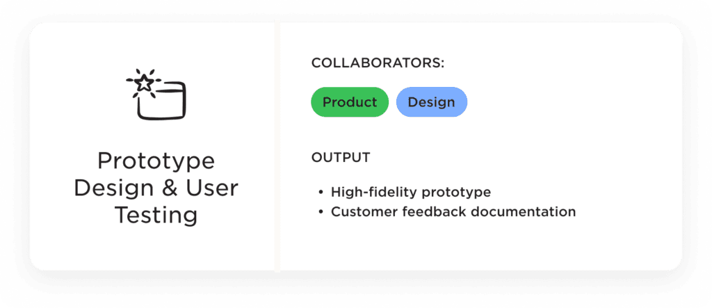
3. Refine and Shape the Experience with Customer Feedback
From the beginning, the team recognized the importance of incorporating customer perspectives to refine and shape our ideas. So, after a few rounds of internal design feedback, we created a prototype of the new feature for user testing.
Testing with recent subscribers
Knowing we needed participants in the right mindset, we recruited customers who had recently purchased the product to share their thoughts on the new post-checkout feature design. After being heads down as a team developing the concept, the external perspective from recent subscribers helped us evaluate the concept clarity and perceived benefits from their point of view.
We saw where they got the most value from the new feature and their expectations that the feature did not address. As a result, we had direction on how to focus the experience to keep their attention and potential ways to better align with their needs.
4. Remain Flexible With Your Eyes on the Shared UX Vision
The final design of the new feature reflected both customer feedback and the team’s vision for the user experience, resulting in an exciting addition to the product that will undoubtedly enhance the overall customer experience.
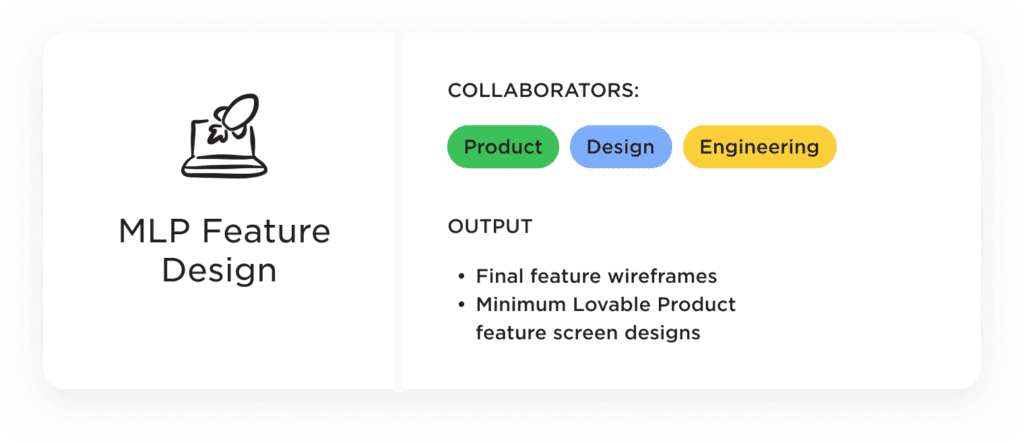
However, given the scope of the feature, the experience needed to be broken down in order to realize the UX vision over time. Thanks to the collaborative process for shaping the design, we worked with engineering to determine next steps towards our end goal for the feature.
Starting with a “Minimum Lovable Product (MLP)” Feature
Equipped with a well-defined strategy, the team quickly transformed the entire experience into an MLP feature that addressed customer needs and seamlessly integrated with the existing user experience. The MLP also acted as a stepping stone toward the envisioned feature experience.
A Strategy-led Process for Collaboration
A strategy-first approach and clear artifacts documenting our progress allowed us to engage and stay in alignment with a cross-functional team during the design process. As a result, we ended with a rich concept and were able to launch a minimum lovable product feature as quickly as possible.
Collaborating across teams is essential for successful new features and product launches – but it can be challenging to put into practice. So if you need an outside partner to help facilitate, build momentum, and create alignment with your team, we’re here to help.