Design thinking in the Age of AI
AI is transforming how we live, work, and communicate. With AI’s help, we can move from idea to product launch at super-speed. Never before have we been able to move
▪ September 26, 2025▪ January 30, 2024
Making product design decisions based on continuous customer feedback should be a top priority for digital health and wellness companies in their growth phase. Not doing so wreaks havoc on core business metrics. Think poor retention rates, stagnant user growth, and bloated customer service requests. All of which can quickly lead to declining revenue and growth.
Incorporating customer perspectives into your product design cycles will impact product design far beyond usability alone. The overarching impact is continually aligning your product offering with user needs and behaviors. Key benefits include:
Health & Wellness Products are Complex User Experiences
It probably goes without saying, but designing a simple, intuitive user experience for health and wellness products is challenging. From daily usage over extended periods of time to inputting complex health information in challenging environments – consider logging baby data in the middle of the night while holding a child to gathering and testing food samples for peanut or egg allergens at children’s birthday party.
On top of this, the product typically provides aggregated data or personalized guidance to help the user adjust their behavior. After all, they started using your service to help them solve a personal need.
With all of this complexity, your product team can’t make assumptions about features, guess when it comes to laying out UI, or worse, rely on vanity metrics. Yet, that’s what many teams do when under pressure to grow a product’s user base.
Faced with these product design challenges and business pressures, how can you keep the needs and behaviors of your users at the center of the design process? Here are 5 effective yet lightweight methods product teams can leverage to continuously gather customer feedback.
Sending targeted short-form surveys focused on specific user segments and interactions can provide valuable feedback on your product’s user experience. The key here is keeping the survey focused and sending it regularly. If it’s too broad, the feedback won’t be as actionable. And if it’s not sent regularly, the recurring needs won’t be as obvious.
Tailoring questionnaire topics to obstacles your users may face at key moments in the customer journey will yield more contextual, actionable insights. For example you might prompt users with a few questions after they complete key actions within the app, such as onboarding, or reach a milestone, completing their first month of customized workouts.
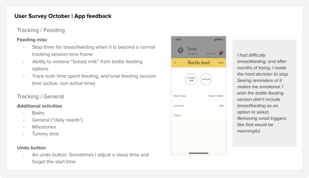
When we designed the Nara Baby Tracking app, we used small-scale surveys to help us understand how new parents used the app. We created cohorts based on baby age and feature usage to gather specific feedback around:

The continuous customer feedback helped us prioritize design improvements and new features we knew new parents and caregivers needed. When the feedback was unclear, or the design implications were hazy, we were able to use follow-up interviews to gather more granular feedback.
Collecting and consolidating the authentic and unfiltered feedback your users share publicly offers a valuable outside-in perspective of your product. From app store ratings to community forum posts and social mentions, think Facebook groups and subreddits; your customer conversations are already occurring broadly.
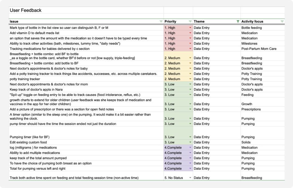
The challenge isn’t gathering the feedback but rather organizing it and interpreting it to understand themes you can use to prioritize UX improvements. You don’t need natural language algorithms or complex sentiment analysis software to help you uncover insights. In fact, a simple spreadsheet can go a long way.
When we designed the Nara app, we used review clustering to help us understand recurrent feedback versus one-off requests. By tagging the review to a theme and activity focus, we were able to understand where the product wasn’t meeting customer needs. It’s a quick method that can have a powerful impact on your product’s UX.

During this process, we learned that users wanted multiple ways to track data. From voice-activated UIs to complaints about trying to input data while holding a crying baby, we learned a lot about data entry needs. Ultimately, the analysis led us to prioritize designing an Apple Watch app that lets people stop timers or input key information quickly.
Continual feedback touch points refer to UI that is embedded within a product allowing customers to conveniently provide quick in-context feedback on their experience. The UI is passive, which means it doesn’t impede someone’s ability to complete a task, and users submit feedback voluntarily.
You’ve probably encountered this UI in the products you’ve used. Some examples of feedback UI include:
You need to be strategic about where you place feedback UI. If it’s not aligned with critical moments in your product’s overall user experience, you may not receive focused customer feedback. It’s also important to keep it short & sweet. When collecting user feedback in a scenario like this, a simple single-page form will result in substantially higher response rates compared to a multi-step wizard flow.

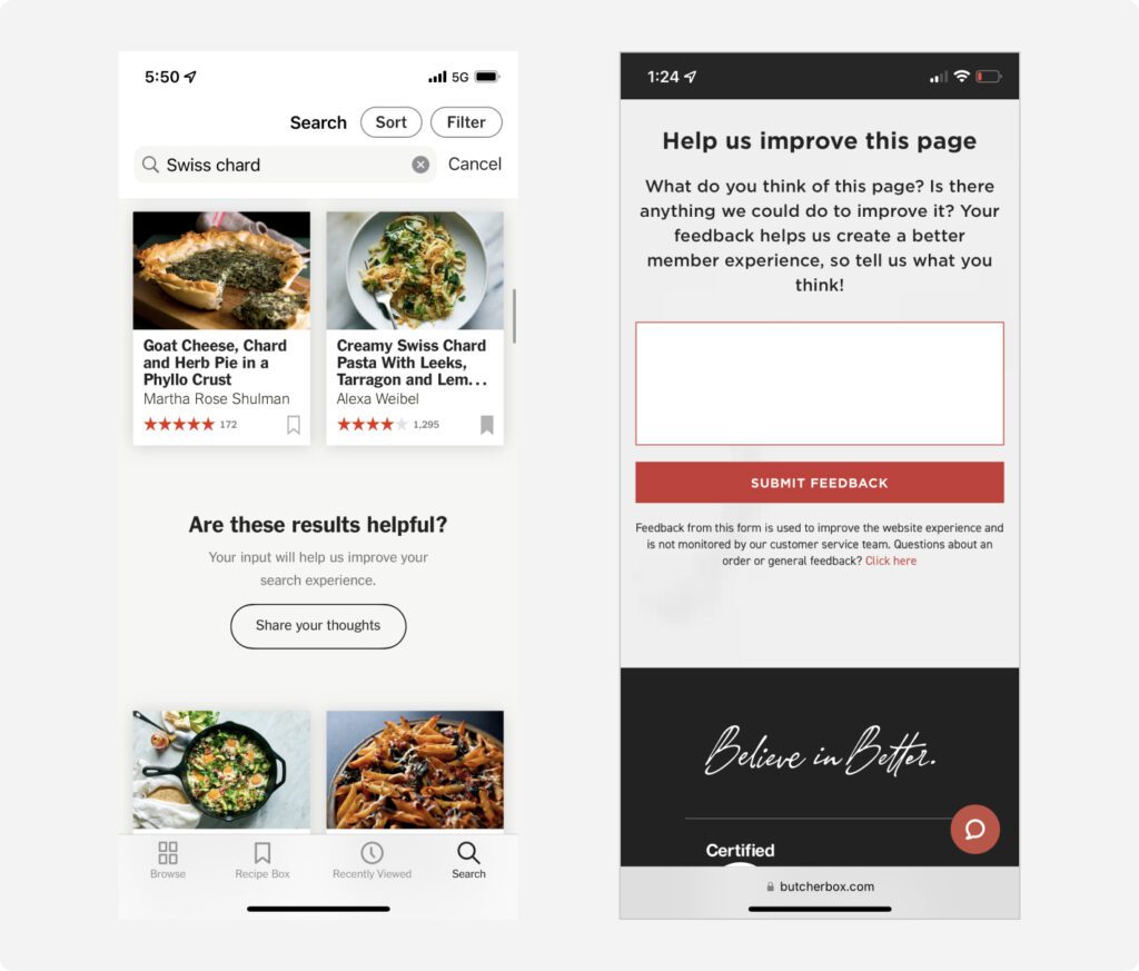
For example, The New York Times cooking app uses feedback touchpoints on its recipe search results page. They want qualitative feedback from users to better understand if search results are helpful. It’s a simple passive UI at a critical moment in the product’s user experience.
Another example occurs on ButcherBox’s new member welcome page. Following a set of modules that help users start their cooking journey, they ask for feedback to help create a better member experience. Again, the UI is a simple form and occurs a critical moment in the product’s user experience.
A Very Important Customer (VIC) Panel consists of a small group of active customers who commit to providing ongoing product input and feedback. The panel typically represents key user segments ensuring you receive feedback across your entire product experience.
Unlike broader feedback aggregation (surveys, cross-channel, and passive UI), panels enable direct, personalized dialogue about the customer experience. This means you can probe deeper into specific use cases or areas needing optimization.
They also allow you to gather constructive reactions on envisioned future experiences. For example, you could discuss the following with your panel:
When we designed the Nara Baby app, we used a Very Important Parent (VIP) panel that allowed us to probe deeper into tracking usage.
Over the course of a month, we asked our participants to send an email or text with a screenshot and/or short note if they have an idea or experience something that could be better in the app. At the end of the month, we sent them a short survey and completed an interview to reflect on their use of the app over that time.
Continuously gathering customer perspectives is critical for designing intuitive, engaging digital health and wellness products. Whether through surveys, review analysis, embedded feedback, or a VIC panel, making the customer experience a priority in your product design process pays dividends. Not only in the form of higher user satisfaction and retention but also through increased innovation and alignment with user needs. By implementing these lightweight feedback methods, product teams can focus on what matters most – creating experiences that improve people’s health, well-being, and quality of life.
AI is transforming how we live, work, and communicate. With AI’s help, we can move from idea to product launch at super-speed. Never before have we been able to move
▪ September 26, 2025In product design, few phrases are as common, or as unhelpful, as “it needs more visual polish.” You’ve heard it in critiques, design reviews, Slack threads, and launch meetings. Everyone
▪ August 22, 2025Most progress dashboards in EdTech leave parents to interpret charts and scores on their own. Generative UI offers a more meaningful alternative by translating student data into clear, contextual narratives.
▪ July 7, 2025