![]()
Zola has been reinventing the online wedding registry since 2013. Months after they first launched, we worked with the Zola team to design their first iPhone and iPad apps. Fast forward five years and Zola had expanded its offerings to include a comprehensive set of wedding planning tools including a planning app. Supporting two separate apps for registry and planning was cumbersome for the tech team and frustrating for the users. We joined forces with the Zola team to help them create one app that integrates the registry and planning tools.
We interviewed couples who were planning their wedding with Zola’s apps. In a sea of wedding tools, we wanted to understand how they found Zola, what was most helpful to them, and the pain points they experienced. We watched them perform specific tasks on their apps and brainstormed with them how Zola could improve their wedding planning.
We learned that wedding planning and registry creation happen multiple times throughout the day on different devices. A couple might start their planning together in front of a desktop, but after that initial set up, the process continues in small chunks throughout the day on their phone. A conversation with a friend might trigger the need to add an item to their registry, a family member might alert them of a spelling error on their website, or they might review their to-do list on their commute. The sessions with couples helped us prioritize the most-used features, creating a cleaner hierarchy for the future app.
Wedding planning is broken up into bite-sized tasks that fit in the “in-between” moments of their day.

Wedding planning is broken up into bite-sized tasks that fit in the “in-between” moments of their day.
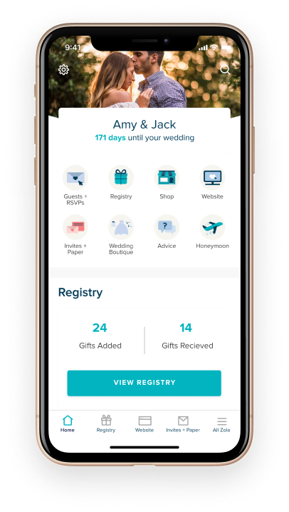
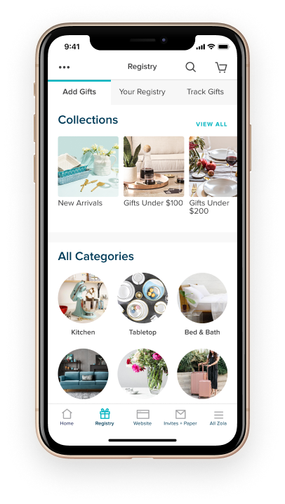
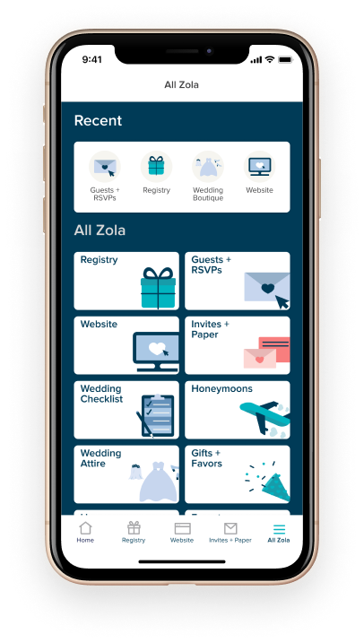
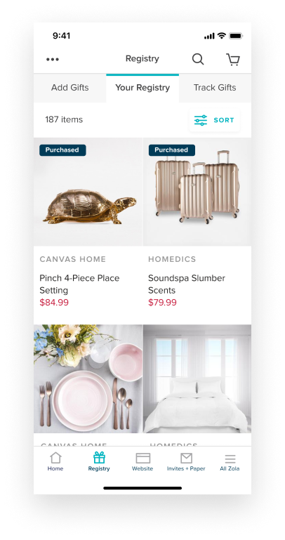
Inspired by the research findings, it was clear that the design needed to support wedding planning “snacking.” We chose a bento-box structure for the app design. This made it easy to pivot between multiple tasks such as adding registry gifts, editing their website, and managing their guest list. We updated the navigation to prioritize frequently accessed categories. We streamlined the wedding website tools to make them more visual with better previews on mobile and desktop. Finally, we simplified the overwhelming task of creating a registry by providing in-line guidance.
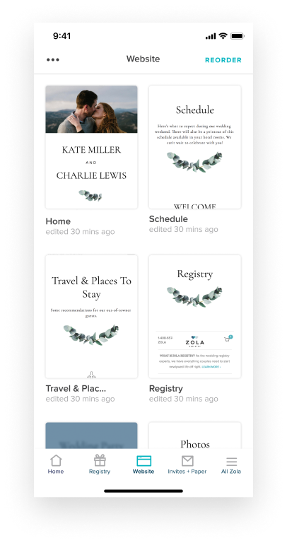
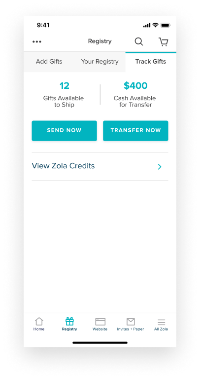
What resulted was a wedding planning app that brings all of Zola’s touchpoints into one destination for its customers. It both simplifies the experience for couples planning their wedding and streamlines offerings for Zola’s business.
Nobu NakaguchiWe’ve worked with Everyday since we started Zola, and they have the most talented design researchers and UX designers that I know. Their ability to analyze and synthesize a problem to deliver a thoughtful, user-centric design solution is invaluable. They are straight up awesome.”
We work as an extension of your team, bringing UX thinking, rapid prototyping, and iterative design from early research all the way to development-ready designs.
We help teams design AI-powered products that users trust. From interaction design to AI UX, we help make complex, variable AI behavior feel intuitive and human.
We evaluate your product with the same critical eye your customers bring, with the design vocabulary to explain what's working, what isn't, and what to do about it.