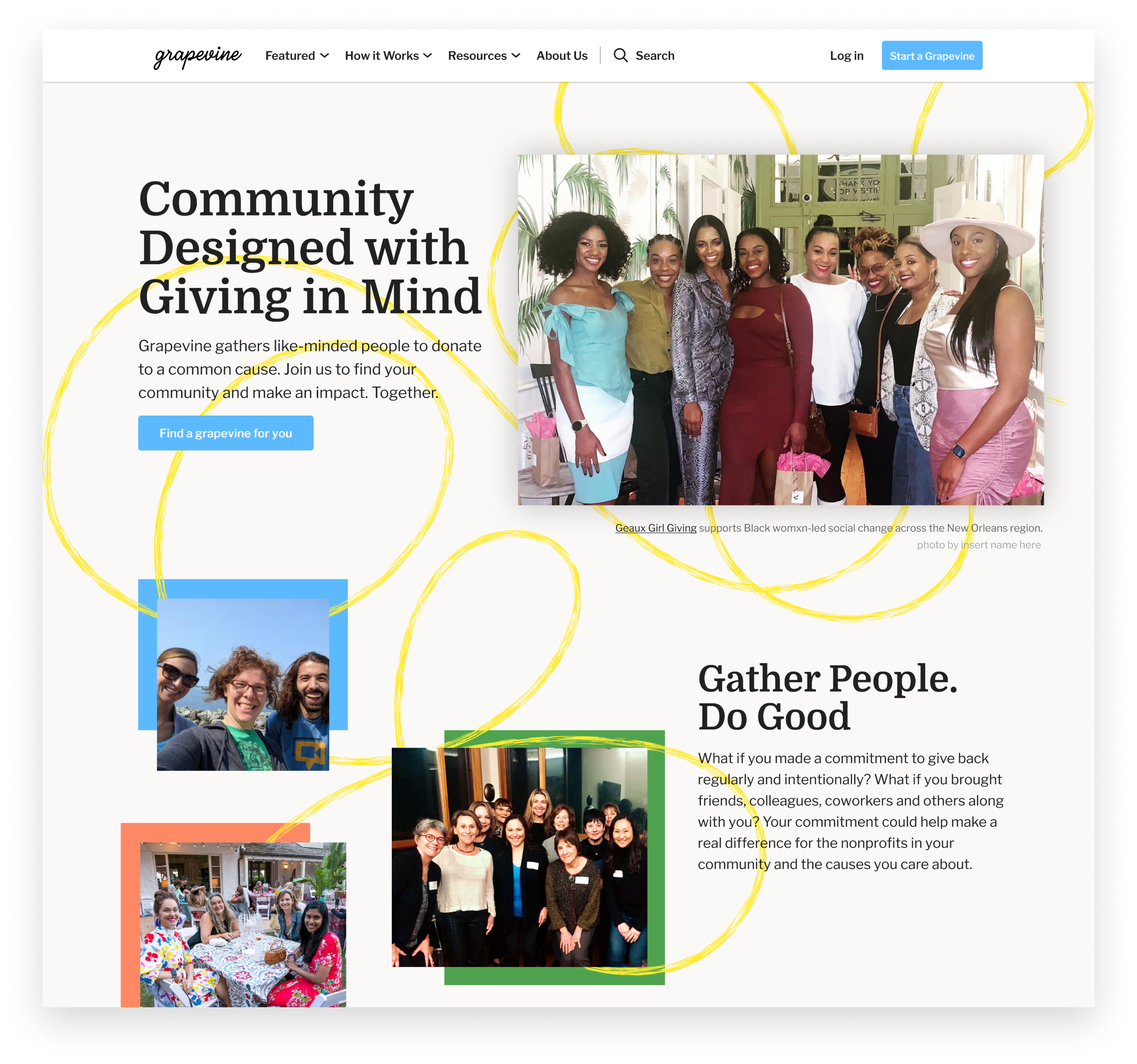
Grapevine is an online platform dedicated to community-based giving, where groups of people, known as giving circles, pool their money and collectively determine where to direct donations. Grapevine offers tools designed to assist leaders in managing their giving circles, encompassing tasks such as handling member donations, coordinating donation events, disbursing funds to nonprofits, and fostering communication among circle members.
Recognizing the need for an enhanced user experience, Grapevine embarked on a UX redesign initiative to revamp its leader onboarding process. Initially centered around a hands-on sales approach, they sought to introduce a self-setup option for circle leaders, complemented by new administrative management tools. The primary objectives of this UX overhaul were to empower leaders to establish their giving circles independently, provide them with the necessary knowledge to confidently invite members post-onboarding, and enhance the overall onboarding experience for members.

In a discovery kickoff session with the Grapevine team, we learned leaders struggled to set group goals, finalize the group page, and invite members. These stumbling blocks in the experience led to leader hesitation to launch their groups.
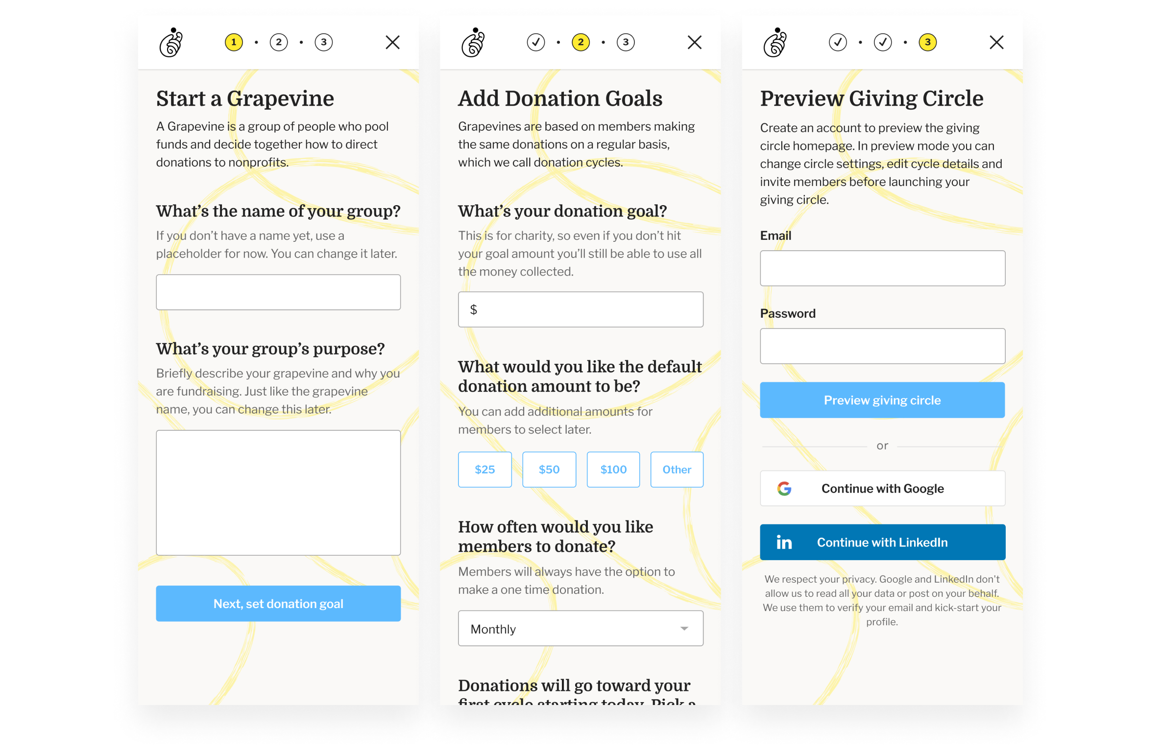
We employed progressive onboarding to build leader confidence and reduce cognitive load at different stages in the circle setup flow. This technique allowed us to gradually introduce leaders to critical features and functionality of the product over time rather than all at once. We broke the initial onboarding experience into three steps, with each step requiring more information from the leader:
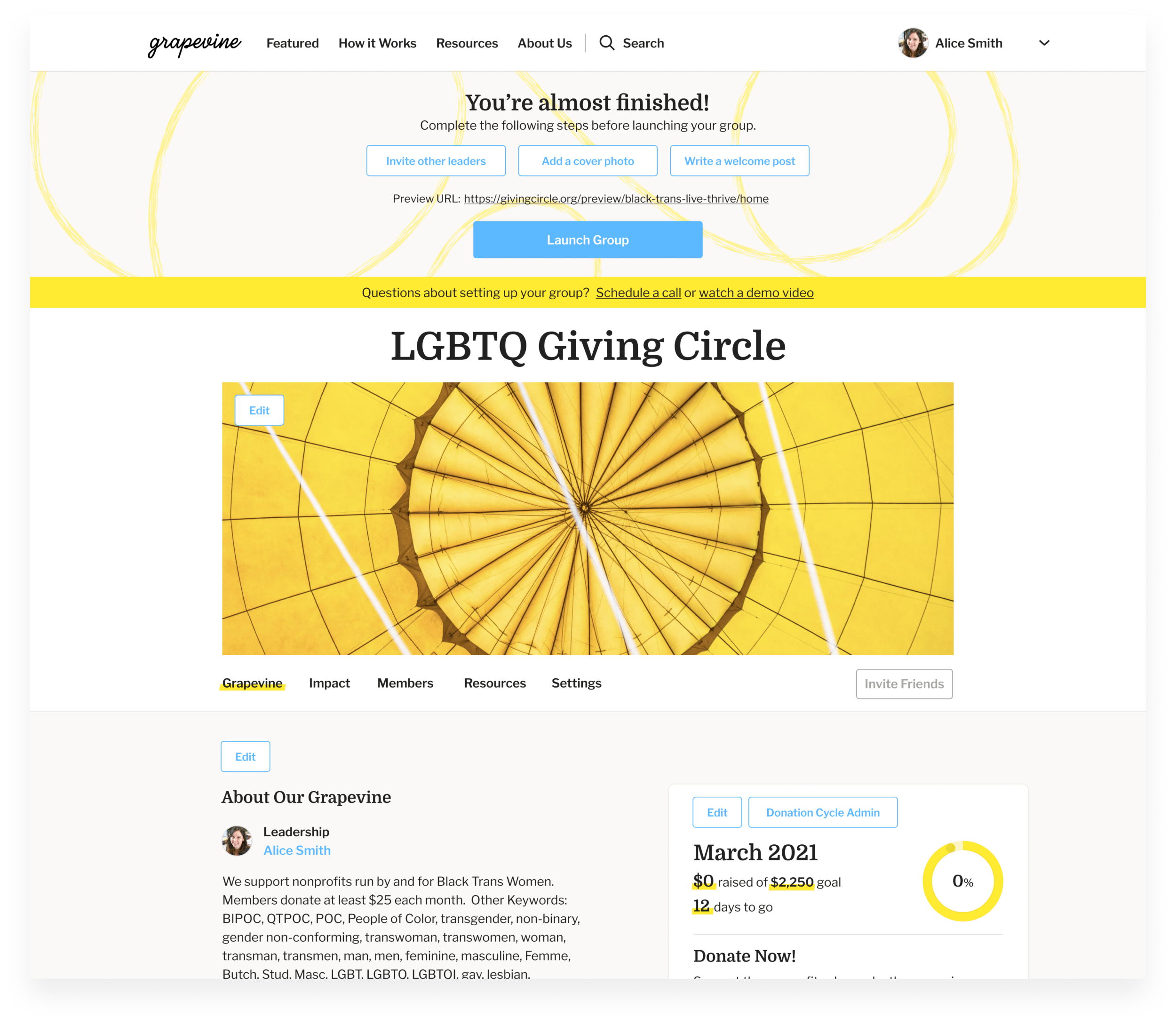
When the leader reaches the second step, the giving circle preview, a module at the top of the page, guides the leader on the final steps before launching the group. A prominent Launch Group CTA below the steps provides a clear “completion” step for the leader.
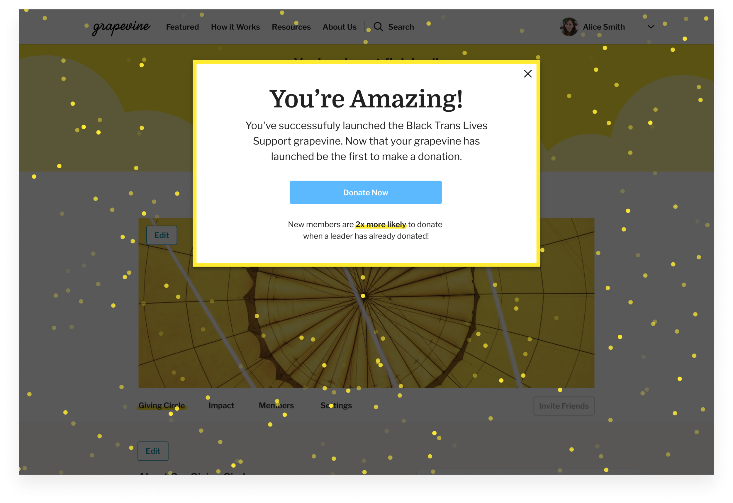
Launching the group is a celebratory moment in the experience. With confetti falling and encouraging messaging, we continue to direct the leader. The congratulatory modal tells the leader to be the first to donate. After the donation, the leader is asked to invite members, continuing the progressive onboarding.
Next, we focused on a UX redesign of the giving circle member experience. We aligned with the Grapevine team on areas needing improvement, including creating a better connection between the first-time join and donate experience, simplifying the donation screen, and encouraging members to be active participants.
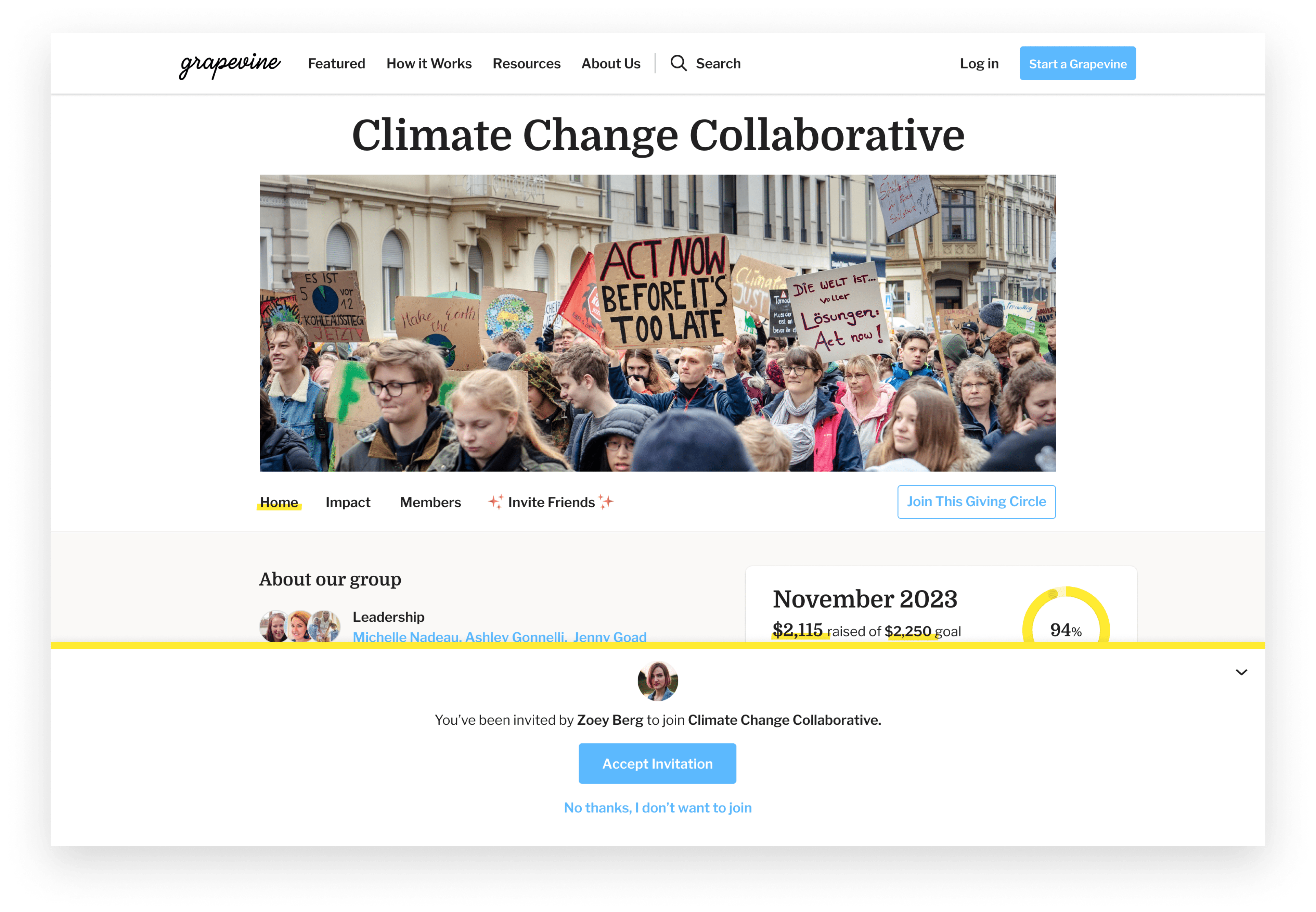
Using a touchpoint map, we connected the leader invite experience with admin tools to the experience of becoming a first-time member. The invite email CTA opens the giving circle homepage with a profile photo of the leader and a custom message, making the first interaction more personal. The new member can then accept the invitation, which launches the new member profile builder.
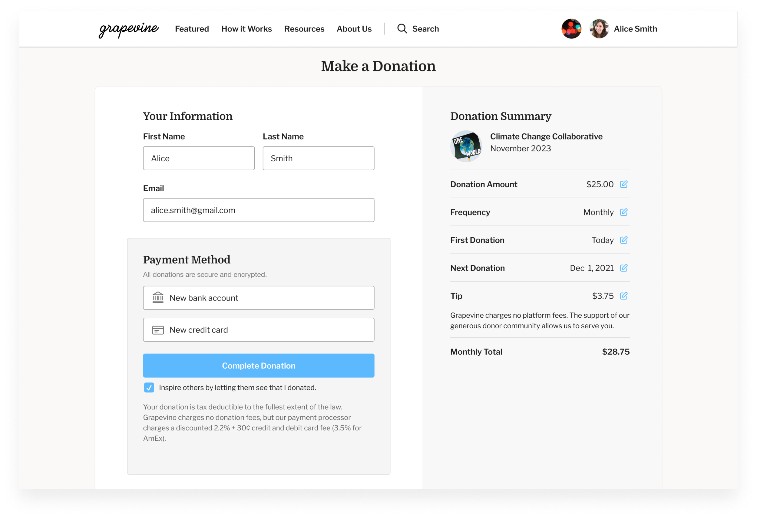
After creating their profile, a new simplified donation experience allows the member to set their recurring donation. With prefilled forms and an editable donation summary, the donation screen is simple and quick.
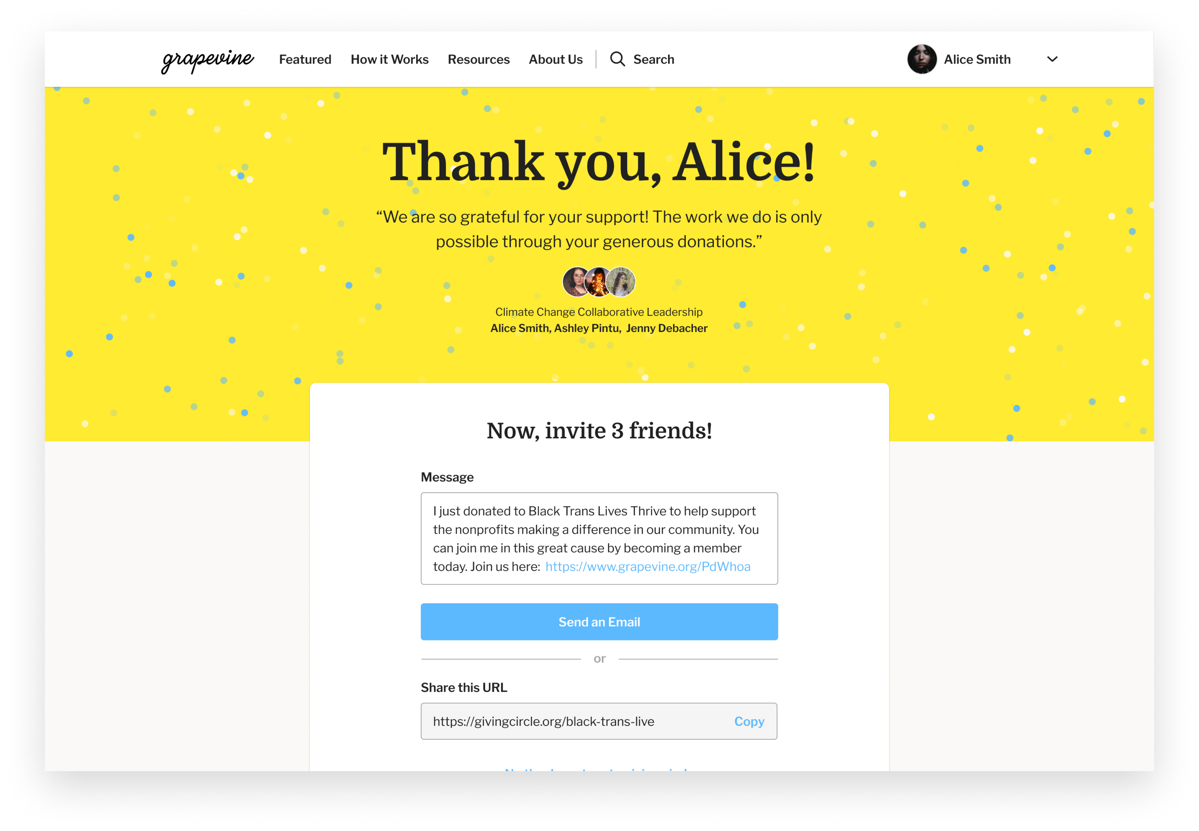
After completing their donation, a custom thank you message from the giving circle leaders and raining confetti welcomes the new member. At this point in the experience, we encourage the member to actively participate by inviting three friends to join the circle.
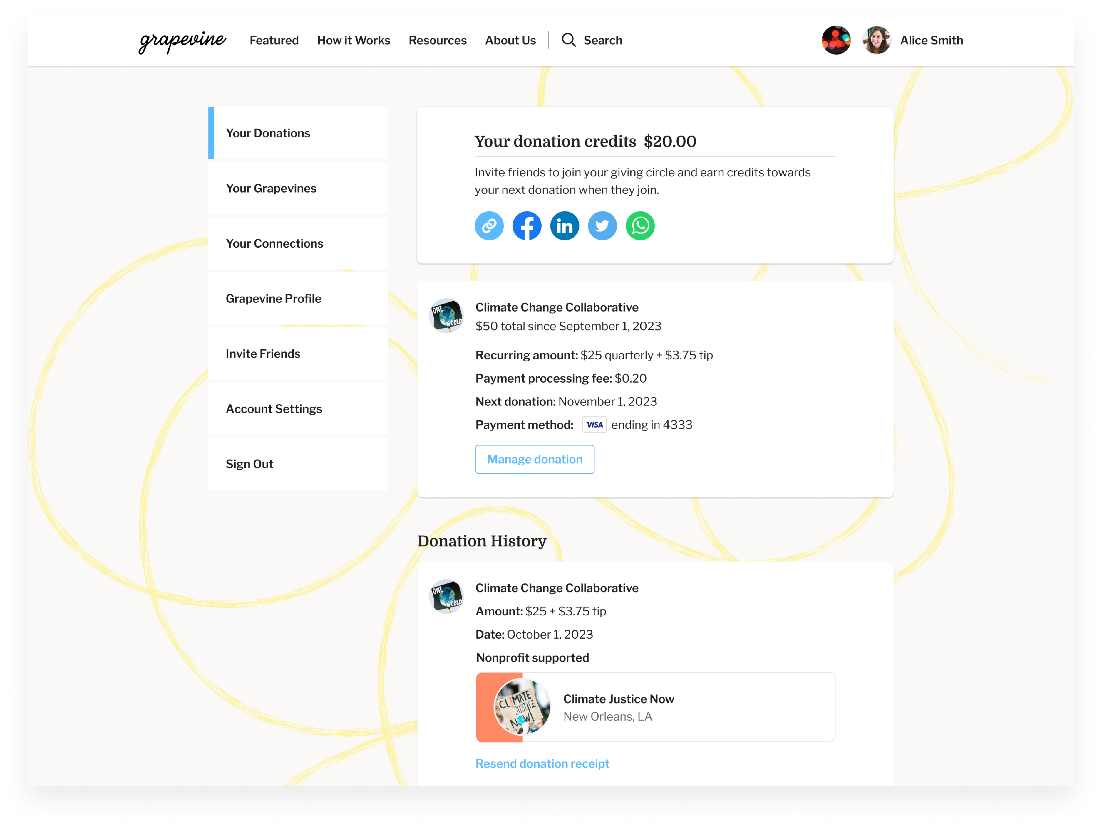
Following the UX redesign of the first-time member experience, we turned our attention to account management tools. The existing tools were limited and created friction for members who needed to manage their donations.
Knowing this friction existed, we designed a new account navigation that prioritized donation management. The member can easily view their recurring donation date, amount, payment method, and history. Management options include changing payment methods, donation amounts, and skipping the next donation. We also designed a cancel donation flow that captures member churn reasons, allowing us to receive real-time feed to improve the product experience.
We’ve continued working with the Grapevine team to evolve the product’s features, designing new landing pages and onboarding flows for geography-based groups. In addition to product design support, we’ve conducted session analysis to understand site behavior, run moderated usability tests, and completed in-depth member interviews to help shape the future product experience.
Emily RasmussenEveryday has been an incredible collaborator, seamlessly integrating with our internal team. Their UX research and product design expertise has been invaluable in guiding us to redesign and prioritize enhancements crucial to group leaders and members.
We partner with you across discovery, design, and delivery acting as an extension of your product team to help shape direction and execute development ready designs.
If users are struggling, dropping off, or not engaging as expected, we help uncover what’s getting in the way and how to fix it. Our focus is on practical improvements that make experiences clearer, easier, and more effective.
Get expert insight into your product experience. Our comprehensive evaluation identifies opportunities to improve usability, engagement, and conversion through design.